
EDMO (Edventure More) is a California-based education nonprofit delivering STEAM and social-emotional learning through after-school programs, summer camps, and year-round school district partnerships. Their model rests on equitable access, reaching kids across the state through both direct enrollment and institutional partnerships funded through programs like ELO-P.
Summer enrollments fell short this year. The economy and shrinking family budgets definitely played a role, but the organization cannot control those factors. Leadership knows this. Their real focus is much sharper: “Is the website itself bleeding conversions?“
This evaluation has a single focus: identifying fixable friction. It pinpoints exactly where users stall when trying to donate, partner, or enroll. The scope covers six URLs across the primary conversion paths. The method is an expert evaluation combining cognitive walkthroughs, heuristic inspection against Nielsen’s ten, and targeted assessment of transactional and information-architecture patterns. Analytics were not available, so findings are diagnostic rather than statistical. They identify probable drop points and the reasoning behind them, ready to be validated against real user data or moderated testing in a follow-on round.
Captured URLs
https://edmo.orghttps://edmo.org/partnershipshttps://edmo.org/summer/enrollhttps://edmo.org/donatehttps://enroll.edmo.org/partner_programs/casa-di-mir-summer-2026-week-6-july-27-july-31https://enroll.edmo.org/partner_programs/edmo-gps-school-year-2026-2027-elo-p
Primary Business Objective
EDMO’s primary business objective, based on publicly available site content, is to provide equitable, high‑quality out‑of‑school learning programs that blend STEAM education with social‑emotional learning (SEL).
Core Objective (in plain terms)
EDMO exists to deliver transformative learning experiences for kids through the following:
- After‑school programs
- Summer camps
- Year‑round expanded learning partnerships with schools.
Their mission centers on equitable access. They aim to reach every kid, including those in under-resourced communities, by partnering with school districts and offering programs that build both academic and emotional skills.
How EDMO pursues that objective
STEAM + SEL curriculum
They combine hands-on science/tech/arts activities with structured social‑emotional learning (self-awareness, collaboration, empathy, etc.).
School partnerships
They work with districts to provide expanded learning opportunities, often funded through programs like ELOP.
“Safe, joyful learning environments”
They emphasize play as a core learning mechanism.
“Equitable access”
Testimonials on the page highlight how EDMO supports families impacted financially and helps districts serve students who otherwise couldn’t access enrichment programs.
In business terms…
If you frame it like a business objective rather than a mission statement, EDMO’s primary objective is
Operate and scale a national nonprofit model that partners with schools to deliver accessible, high‑impact STEAM and SEL enrichment programs outside regular school hours.
Primary Conversion Event
The website is currently targeting partnerships. It changes. Depending on the quarter or time of year, it will shift from partnerships to more enrollments. These two are the same type of conversion event: form fills.
Top 3 User Goals
- Partner Acquisitions. Partners should be able to understand what EDMO is and how it benefits them (the partner). Their objective goal is to understand, navigate through the partnership process, and submit their inquiry.
- Donations. Donors should be able to understand what EDMO is and the non-profit’s goals. Their objective is to understand and go through the donation form and contribute their donations. Then receive a confirmation of their contribution.
- Camp Sign-ups. Parents should be able to understand the benefits of the “Edmo Method” to feel encouraged to enroll their children in one of the programs currently offered for summer programs. They will go through a program page, see a list of programs, and sign up for a program of their choice. This should lead to a conversion.
Primary Audience
There are three primary audiences:
The partners. These are the school districts that engage EDMO for services and sponsor the summer camp venues in California. A partner can also be another nonprofit related to education.
The donors are any person or organization that voluntarily gives resources to support the nonprofit’s mission. The gift can take different forms: money, time, services, or goods.
The parents are the consumers. They are the ones who will enroll their children in the programs created by Edmo. They are paying customers.
Secondary Audience
- Normal visitors – Regularly checking the website for information. Not necessarily to purchase or to make a connection.
- Visitors seeking employment.
Existing Analytics Report
Not Available.
The mutually agreed device and browser matrix
Browser: any acceptable modern browser (2015-2026); mobile devices: standard tablet devices, phones with 360-500 px portrait width.
Scoped Boundaries agreed in Writing
Assessment only, no consulting. User flow assessment only for the provided URLs. Skipping any part that cannot be justified or proved due to a lack of analytics data.
The homepage is seasonal. Its content and primary CTA shift throughout the year, moving between enrollment and partnership priorities.
Task Definitions
- Task: Complete a Donor contribution
- Linked User Goal: Donations
- Expected Happy Path: Click CTA, pick a type of donation (one-time, monthly, annually), pick an amount, include dedications and notes, click next, enter required personal information, click next, enter required payment information, and submit.
- Success Criteria: Donation has been accepted
- Task: Complete a Partner Enquiry
- Linked User Goal: Partnership acquisitions
- Expected Happy Path: Click the CTA, fill out the partner inquiry form, and submit.
- Success Criteria: Expect a contact back, by phone or email.
- Task: Parents signing up their children for camp/programs
- Linked User Goal: Camp signups
- Expected Happy Path: Unavailable (not in season) (pick a program, fill in information, fill in payment method)
- Success Criteria: payment accepted, confirmation email received.
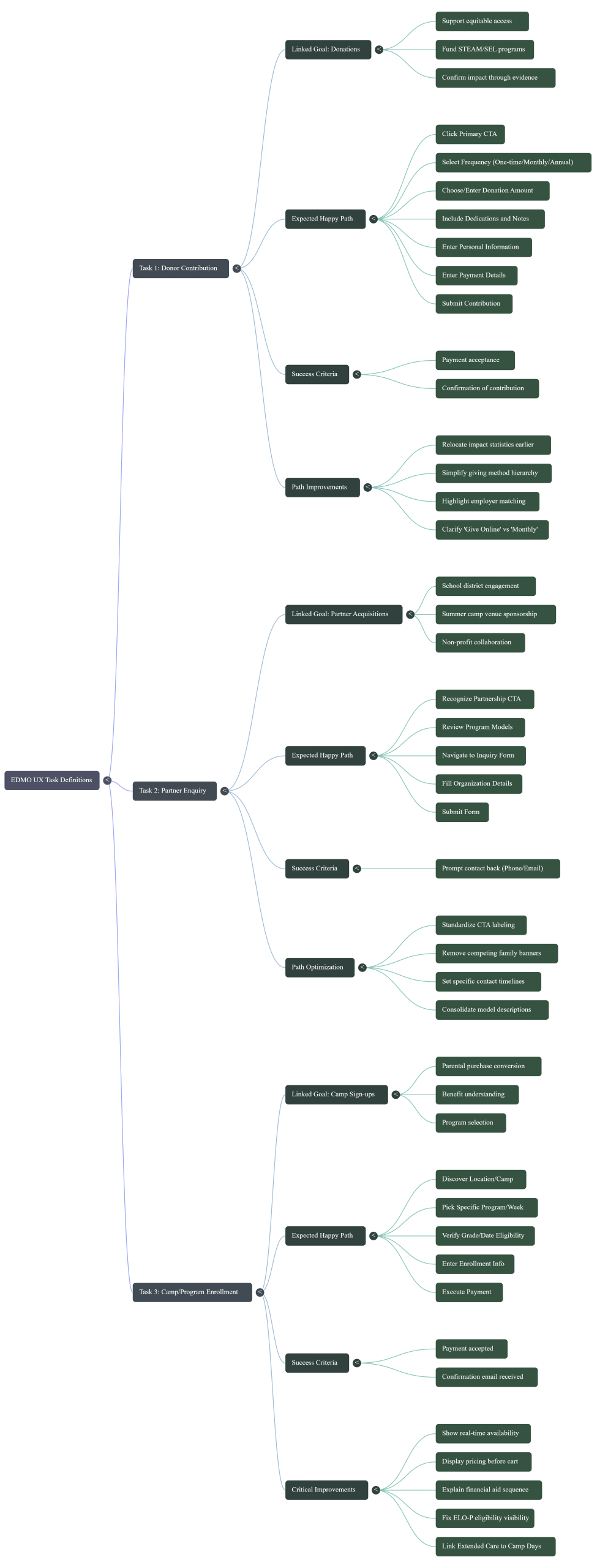
Cold First Impression
Home Page
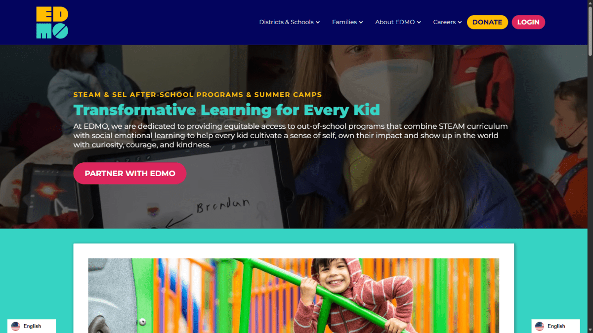
Five-second exposure, what the site is
An education nonprofit providing STEAM and social-emotional learning after-school and summer programs.
Who is it for
Initially, school districts and organizations. Families are clearly another audience, but the prominent “Partner with EDMO” action gives the homepage a district-partnership orientation.
Obvious next Action
“Partner with EDMO.” This is clear for a school administrator but less clear for a parent looking for a camp.
Credibility and Trust “Feel”
The program proposition is specific. Phrases such as “Transformative Learning for Every Kid,” “ripple effect,” and “change the world” are more generic nonprofit language, but they do not obscure the actual service.
Partner landing page
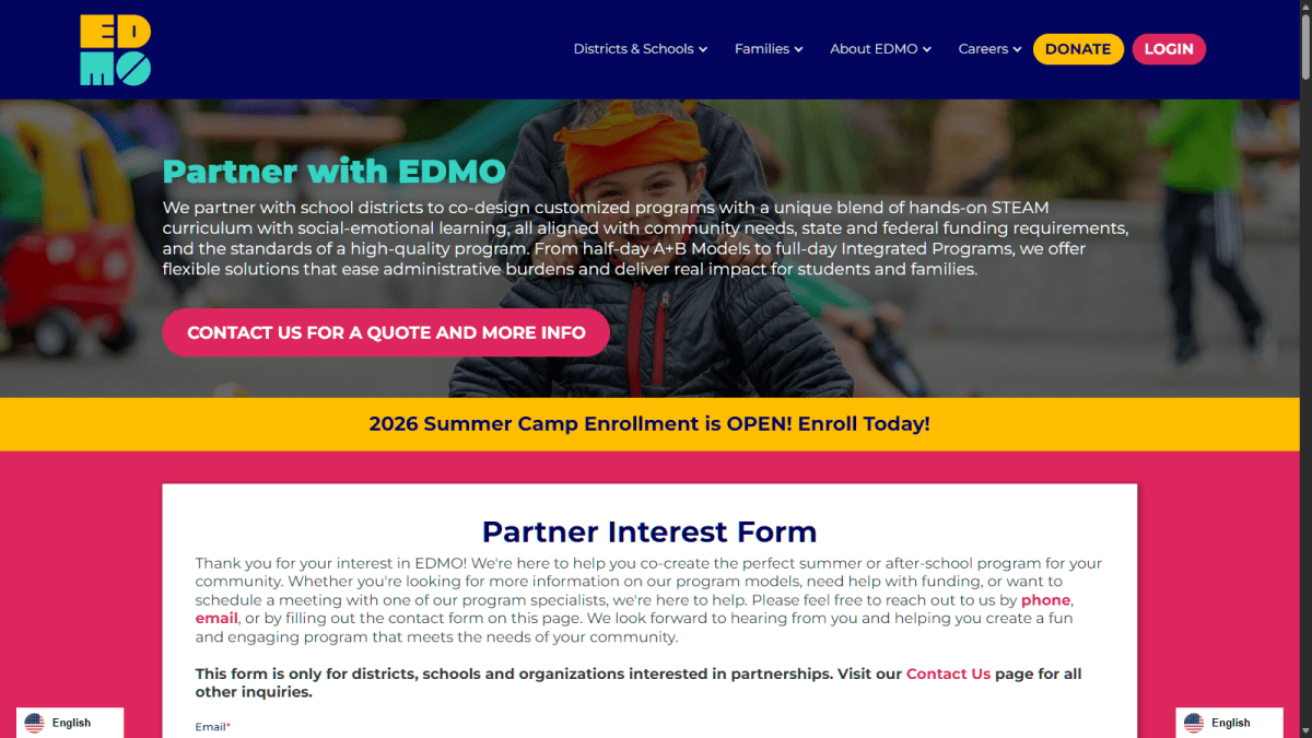
Five-second exposure, what the site is
A B2B lead-generation page for districts seeking outsourced or co-designed after-school and summer programming.
Who is it for
District administrators, expanded-learning directors, school leaders, procurement stakeholders, and people responsible for ELO-P, ASES, or similar funding.
Obvious next Action
“Contact Us For a Quote and More Info.”
Credibility and Trust “Feel”
Initial trust: Strong. The page quickly names funding programs, compliance concerns, program formats, measurable results, existing partners, and concrete operational benefits.
Immediate concern: A family-oriented banner, “2026 Summer Camp Enrollment is OPEN! Enroll Today!” appears directly beside the partnership conversion path. That introduces a second audience and an unrelated goal at the exact moment the page should be qualifying district leads.
Donate Page
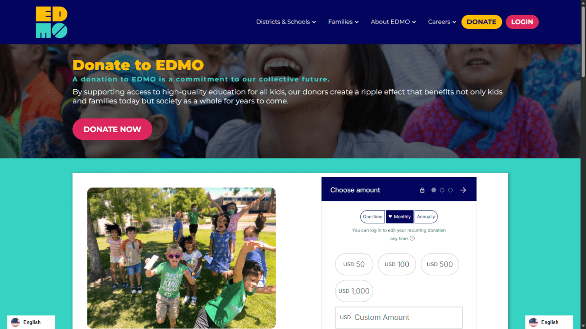
Five-second exposure, what the site is
A nonprofit fundraising page supporting access to EDMO programs.
Who is it for
Individual donors, recurring donors, employers, philanthropic organizations, donor-advised fund holders, and major-gift prospects.
Obvious next Action
“Donate Now.”
Credibility and Trust “Feel”
Initial trust: Strong. The page provides impact figures, multiple giving methods, direct organizational contact details, nonprofit context, and EDMO’s EIN.
Generic impression: The opening “commitment to our collective future” message is emotionally appropriate but broad. The page becomes much more convincing later when it presents concrete program outcomes and participation figures.
Cognitive walkthrough: Partner with us
| Step | Walkthrough result | Health |
|---|---|---|
| 1. Recognise the homepage partnership CTA | A district user will likely recognize “Partner with EDMO” as relevant. It is visible, goal-oriented, and uses the organization’s name. | Healthy |
| 2. Arrive on the partnerships page | The destination confirms that EDMO partners with school districts and explains customized STEAM/SEL programs. The user receives clear feedback that the correct destination was reached. | Healthy |
| 3. Decide whether EDMO fits the district’s needs | Funding, compliance, models, measurable results, and district pain points are addressed. The page gives the user enough information to justify continuing. | Healthy, but overlong |
| 4. Identify the lead-generation action | The user sees several different actions: “Contact Us For a Quote and More Info,” “Get Started with EDMO,” and “Talk to Our Team.” They appear to represent essentially the same goal but use different language. | Mixed |
| 5. Avoid the competing enrollment route | The summer-camp enrollment promotion is aimed at families rather than partnership buyers. A user can distinguish it, but it creates avoidable decision noise. | Weak |
| 6. Reach the Partner Inquiry Form page | The destination clearly says it is for districts, schools, and organizations and redirects other users to the general contact page. This is a good qualification and recovery design. | Healthy |
| 7. Understand what happens after submission | The page says someone will respond “shortly,” but does not provide an expected response time, describe the next conversation, identify required preparation, or explain whether the user will receive confirmation. | Needs improvement |
| 8. Complete and submit the form | Embedded fields, required-field behavior, keyboard flow, validation, submission feedback, and confirmation could not be inspected. No information was submitted. | Unverified |
Partner flow failure points
1. The primary action changes names repeatedly.
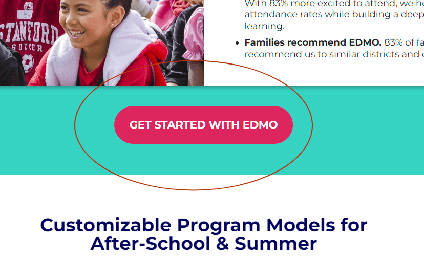
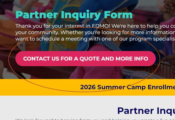
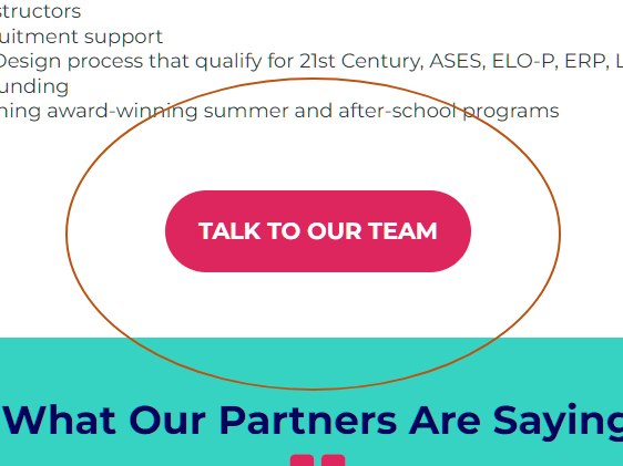
The path moves through:
(1) Homepage → CTA: Contact Us For a Quote and More Info → Partner with EDMO → (duplicate) CTA: Contact Us For a Quote and More Info → Partner Inquiry Form(2) Homepage → CTA: Contact Us For a Quote and More Info → Partner with EDMO → CTA: Get Started with EDMO → Partner Inquiry Form(3) Homepage → CTA: Contact Us For a Quote and More Info → Partner with EDMO → CTA: Talk with our Team → Partner Inquiry Form(4) Partner Inquiry Form → CTA: Contact Us For a Quote and More Info → (scrolls)CTAs on 1, 2, and 3 all lead to the Partner Inquiry form. But the Partner with EDMO page also has two forms: “Partner Interest Form” and “Get Started with EDMO”. Are these all the same process, or do they lead to different levels of engagement?
Recommendation: Use one conversion label consistently, such as “Request a Partnership Consultation.” Secondary text can explain that the consultation may include program information, funding guidance, and a quote.
2. The partnership page contains an unrelated family conversion.
The enrollment promotion competes with the district inquiry, weakening audience focus. This is the largest problem in the partner path.
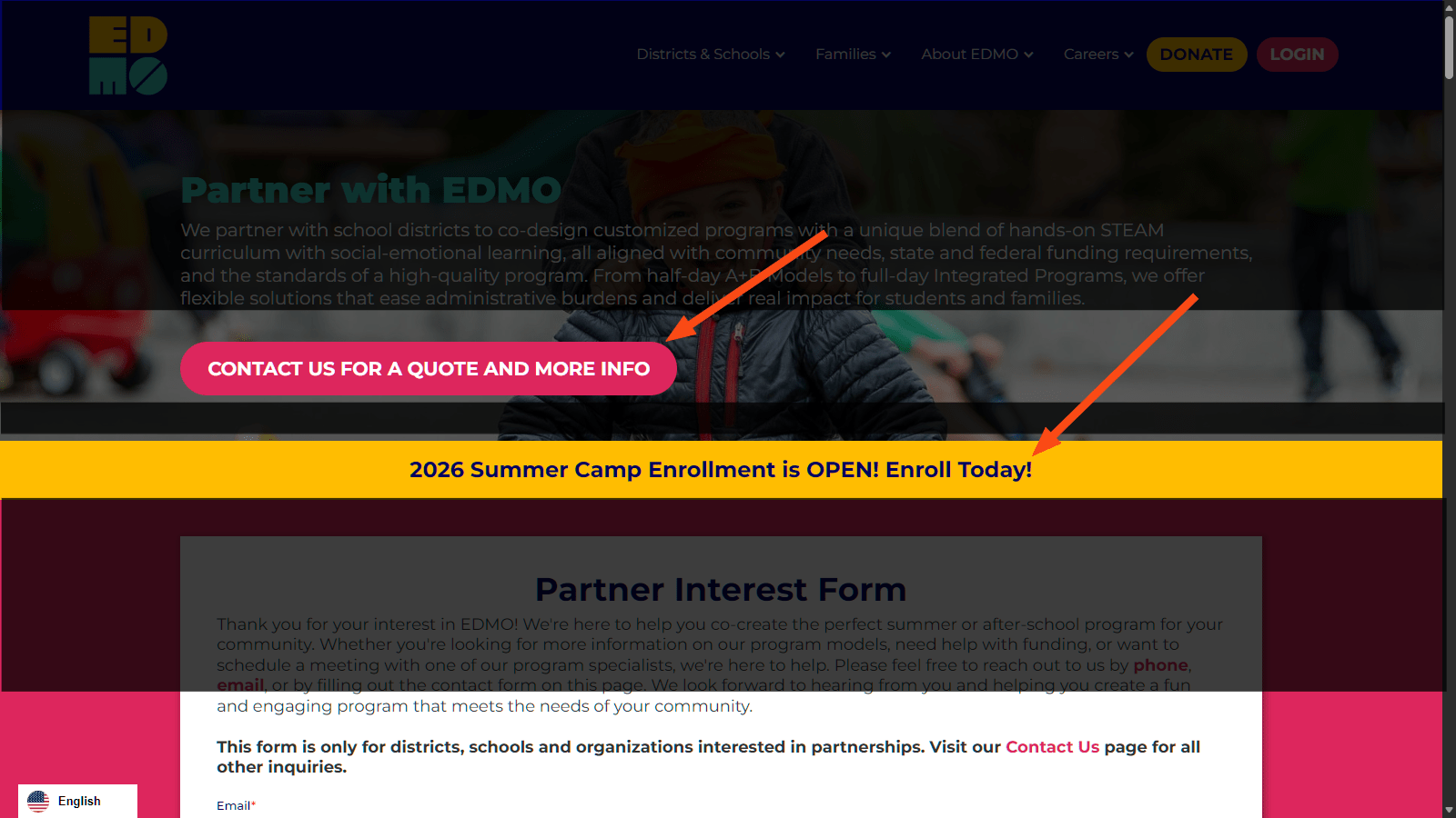
Recommendation: Remove the enrollment banner from partnership pages or reduce it to a quiet utility link labelled “Looking for camps for your child?”
3. Navigate to Partner Inquiry
(See: 1) The Partner Inquiry form has a redundant button on the banner that does nothing but go to the same page. It seems they are on the same pages. Either page duplication, intentional duplication for A/B testing, or the same page with different routing URLs.
4. The user must navigate through a lengthy sales page.
Program models and supporting information are extensive, and some concepts are repeated in multiple page sections. The user can act early, but the length makes comparison and decision-making harder.
Recommendation: Present the four core program models in one concise comparison section, followed by funding/compliance, outcomes, proof, and one repeated CTA.
5. The inquiry page does not set expectations.
“Someone will be in touch shortly” is vague.

Recommendation: Add a compact next-step statement:
“After submission, a partnership specialist will contact you within two business days to discuss your district, program calendar, student population, funding sources, and preferred operating model.”
Cognitive walkthrough: Donate
| Step | Walkthrough result | Health |
|---|---|---|
| 1. Recognise the donation action | “Donate Today” is explicit and directly associated with supporting EDMO. The header/footer donation route also gives returning donors a predictable shortcut. | Healthy |
| 2. Arrive on the donation page | The heading “Donate to EDMO” immediately confirms the destination. The user is not forced to infer whether the page is informational or transactional. | Healthy |
| 3. Understand why to donate | The opening explains the broad purpose, while later sections connect donations to access, confidence, learning, and under-resourced communities. | Healthy |
| 4. Notice the correct action | “Donate Now” appears immediately and is repeated elsewhere. The primary task is visible and recognizable. | Healthy |
| 5. Establish trust before payment | The page includes the EIN, impact statistics, contact information, specific giving alternatives, and language describing the online portal as secure. | Healthy |
| 6. Choose between online and alternative giving | One-time, recurring, monthly, sponsorship, DAF, matching, stock, vehicle, and planned-giving options are available. This supports many donor types but introduces considerable choice. | Mixed |
| 7. Open the embedded donation process | The page contains an embedded donation area, but its amount-selection and checkout controls were not exposed to the browsing environment. | Unverified |
| 8. Enter identity and payment information | Intentionally not performed. No email address, contact information, or payment data was entered. | Not tested |
| 9. Receive confirmation or recover from an error | Confirmation, receipt delivery, declined-payment behavior, fee/tip disclosure, and abandonment recovery could not be assessed. | Unverified |
Donation flow failure points
1. The strongest evidence comes after the initial ask.
The page asks for a donation before showing its most persuasive figures: partner districts, schools, annual reach, working-family reliance, and return intent.
Recommendation: Put two or three high-value proof points beside the primary donation form. For example:
14,872 kids and families reached annually
96% of families rely on EDMO so they can work
90% say they will return
The figures are already present; they need to support the decision earlier.
2. The page mixes the primary donation with every possible giving method.
The breadth is useful, but users ready to make a normal online gift should not have to process eight giving alternatives.
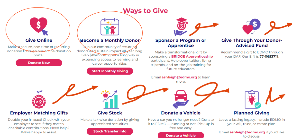
Recommendation: Preserve “Give Once” and “Give Monthly” as the primary choices. Place stock, vehicle, DAF, sponsorship, employer matching, and planned giving inside a secondary “Other ways to give” section.
3. The opening copy is less persuasive than the later copy.
“A commitment to our collective future” is emotionally positive but could apply to nearly any education nonprofit.

Recommendation: Lead with the tangible outcome:
“Help more kids access safe, high-quality STEAM and social-emotional-learning programs after school and during the summer.”
Cognitive Walkthrough: additional pages
| Step | Walkthrough result | Health |
|---|---|---|
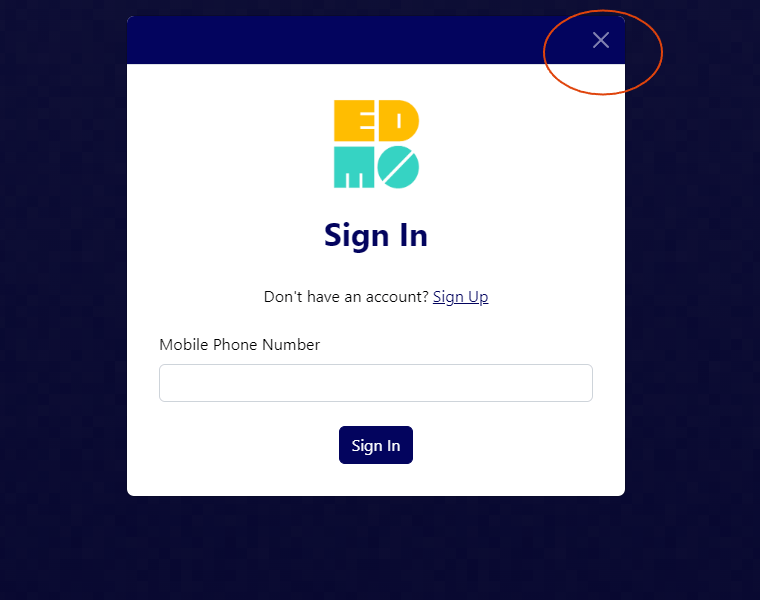
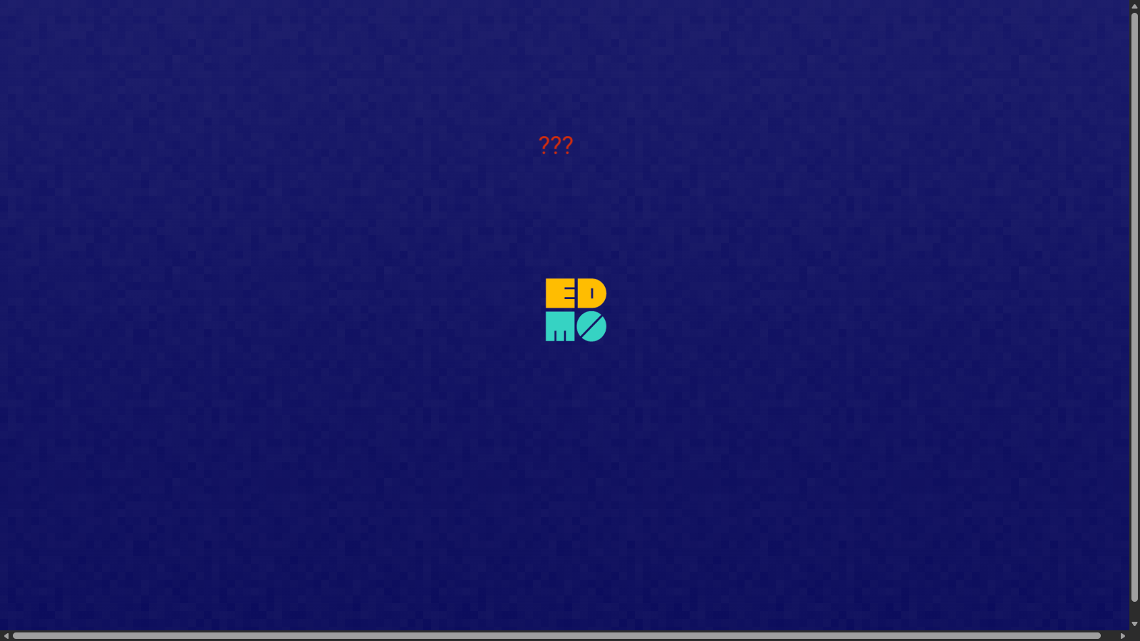
| 1. Navigating to the Login Page | If I close the login dialogue, there’s no more action that can be done. The user will have to use the browser’s native back button. | Minor |
Overall verdict
Partner flow: Mostly healthy, with one significant audience-conflict issue and several smaller clarity and expectation-setting concerns.
Donate flow: Mostly healthy through the donation-page entry. The purpose, trust signals, and primary action are clear, but the page could better prioritize standard online giving and present its strongest impact evidence earlier. The transactional portion remains unverified.
Notes
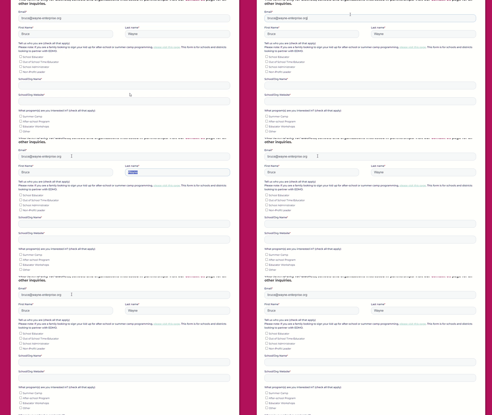
Accessibility: Keyboard navigation follows a logical sequence, but the checkboxes do not have a selection indicator when tabbed to.
Concise Nielsen 10 Heuristics Evaluation
Scope: Six specified URLs only. No unrelated links, checkout, form submissions, personal information, or payments were used. Screenshots were skipped as requested.
Severity:
- 1 – Cosmetic
- 2 – Minor
- 3 – Major
- 4 – Catastrophe (Critical/blocking risk)
Overall page health
| Page | Health | Summary |
|---|---|---|
| Homepage | Mostly healthy | Clear mission, but the opening mixes family and institutional audiences. |
| Partnerships | Needs improvement | Strong information, weakened by duplication, competing audiences, and inconsistent CTAs. |
| Summer enrollment | Needs improvement | Clear camp proposition, but the “near you” discovery experience is extremely limited. |
| Donate | Mostly healthy | Credible and informative, but gives equal prominence to too many donation paths. |
| Casa di Mir enrollment | Poor | Contains serious timing, add-on, quantity, and financial-assistance risks. |
| GPS ELO-P enrollment | Needs Improvement | Eligibility affects whether the user should proceed at all, so it should not depend on noticing a sentence inside the introductory paragraph. |
Violation log
| ID | Location and element | Heuristic | Sev. | Finding and recommendation |
|---|---|---|---|---|
| comp-01 | Global Component: Navigation Bar | Aesthetic and minimalist design; mobile viewport efficiency | 1 | A large logo makes the navigation excessively tall |
| comp-02 | Global Component: Login Page | User control and freedom; dead-end recovery | 2 | Closing login leaves no internal route back |
| H-01 | Homepage hero | Match with the real world; recognition | 2 | The heading addresses after-school programs and summer camps, but the first prominent action is only “Partner with EDMO.” Families must continue farther before encountering “Enroll in Summer Camp.” Separate the hero into clearly labeled “For Families” and “For Schools” routes. |
| H-02 | Homepage partnership CTAs | Consistency and standards | 1 | The same apparent goal is labeled “Partner with EDMO” and “Partner with Us.” Standardize one label across the site. |
| H-03 | Homepage partnership CTAs | Aesthetic and minimalist design | 1 | The copy on the hero banner is too dense. Dense copy appears throughout the homepage. |
| H-04 | Homepage partnership CTAs | Aesthetic and minimalist design; consistency | 1 | Partner CTA may be redundant. Another CTA in the section after the hero banner is present, but not necessarily bad. |
| P-01 | Partnerships hero | Aesthetic and minimalist design | 3 | The institutional “Contact Us For a Quote and More Info” action competes directly with “2026 Summer Camp Enrollment is OPEN!” which targets families. Remove or visually subordinate the family promotion on this B2B page. |
| P-02 | Program models | Minimalism: Gerhardt-Powals information reduction | 3 | The after-school, full-day, integrated, A+B, and blended models are substantially described twice. This lengthens comparison and makes users question whether the repeated sections contain different information. Consolidate them into one comparison module. |
| P-03 | Partnership conversion controls | Consistency; recognition rather than recall | 1 | One inquiry path is described as “Contact Us For a Quote and More Info,” “Get Started with EDMO,” and “Talk to Our Team.” Use one consistent action, such as “Request a Partnership Consultation.” |
| S-01 | “Find An EDMO Summer Camp Near You” | Match with the real world; flexibility | 3 | The page promises location discovery but exposes only San Jose / Casa di Mir Montessori, with no visible search, location entry, distance, or explanation that this is the only available camp. Either provide a genuine location search or change the heading to accurately describe the available location. |
| S-02 | Camp listing | Visibility of system status | 3 | The camp is shown with dates and a generic “Get Started” action, but no visible availability, sold-out state, registration deadline, or remaining-week status. Show current availability before sending users into registration. |
| S-03 | Camp decision information | Flexibility and efficiency | 2 | Families receive location, grade range, and dates, but no price before opening the enrollment product. Price is a primary decision factor and should appear in the listing. |
| D-01 | Donate hero and impact section | Recognition; transactional clarity | 2 | The primary donation request appears before the strongest evidence, while impact figures are placed after the long list of giving methods. Move two or three impact figures beside the initial donation action. |
| D-02 | “Give Online” and “Become a Monthly Donor” | Consistency and standards | 2 | Give Online already says it supports one-time or recurring donations, but monthly giving is also presented as a separate route. Clarify whether these open the same form and present one-time and monthly as explicit choices. |
| D-03 | Ways to Give | Minimalism: Gerhardt-Powals information reduction | 2 | Online, monthly, sponsorship, DAF, matching, stock, vehicle, and planned giving are presented in one sequence. This creates unnecessary choices for ordinary donors. Prioritize online and monthly giving, then collapse the others under “Other ways to give.” |
| C-01 | Extended Care add-on | Error prevention | 3 | The page says Extended Care cannot be accepted without a matching Camp Day registration but still presents it as independently addable. Do not rely only on instructional text; require or automatically associate a qualifying Camp Day product. |
| C-02 | Financial-aid route | User control; help and documentation | 3 | Financial aid sends families to an external Asana form without explaining whether they should apply before purchasing, whether a place is reserved, or how long approval takes. State the sequence and seat-reservation policy before the link. |
| C-03 | Curriculum-theme links | Flexibility and efficiency | 2 | Theme links open a long general curriculum page rather than the exact named grade/theme section. Deep-link each theme to its corresponding section so users do not have to search again. |
| G-01 | $0.00 and Add to cart | Match between the system and real world | 1 | “Add to cart” uses an e-commerce mental model for school-program enrollment. “Enroll” or “Start registration” would better describe the action. |
| G-02 | Eligibility statement in the introductory paragraph | Error prevention; recognition | 3 | “ELO-P eligible participants only” is consequential but buried at the end of body copy. Place the eligibility requirement beside the program card and CTA so ineligible families do not begin the process accidentally. |
| G-03 | $0.00 price | Visibility and clarity | 2 | The page does not explain whether the program is entirely free, free only for eligible participants, or whether later charges may apply. Label it “Free for eligible ELO-P participants” or explain the cost structure. |
| G-04 | Program card | Visibility of system status | 2 | The CTA implies registration is open, but the card does not explicitly state availability, registration status, or whether a waitlist applies. |
| G-05 | Program naming | Consistency and standards | 1 | The page alternates between 2026–2027, 26–’27, ELO-P, and ELOP. This is understandable but should be standardized. |
Nielsen coverage
| Heuristic | Logged violations | Maximum severity | Affected pages |
|---|---|---|---|
| Visibility of system status | 3 | 3 – Major | Summer enrollment, GPS ELO-P |
| Match between system and the real world | 2 | 3 – Major | Summer enrollment, GPS ELO-P |
| User control and freedom | 2 | 3 – Major | Login, financial-aid route |
| Consistency and standards | 2 | 2 – Minor | Donate, GPS ELO-P |
| Error prevention | 2 | 3 – Major | Casa di Mir, GPS ELO-P |
| Recognition rather than recall | 1 | 3 – Major | GPS ELO-P |
| Flexibility and efficiency of use | 2 | 2 – Minor | Summer enrollment, Casa di Mir |
| Aesthetic and minimalist design | 4 | 3 – Major | Homepage, Partnerships, Donate |
| Error recognition and recovery | 0 verified | Not testable | Submission states excluded |
| Help and documentation | 1 | 3 – Major | Casa di Mir |
Priority fixes
- Immediately prevent enrollment in expired or already-running sessions.
- Enforce the Camp Day requirement for Extended Care in the interface.
- Remove the family-enrollment promotion from the partnership conversion area.
- Replace duplicated partnership-model content with one comparison section.
- Make summer-camp discovery accurately reflect the available locations, prices, and availability.
Recommended services not included in the agreement
- Accessibility Audit (WCAG 2.2 AA) (Automated + Manual)
- Information Architecture and Content Evaluation
- Performance and Technical Friction Test
- Proper Usability testing with Humans involved (A School District user, a donor, and a parent)