I’ve been invited by a marketing team to conduct an independent UX and accessibility audit of one of their live production projects. The review will cover heuristic evaluation, visual design critique, information architecture, and WCAG 2.2 AA conformance testing. Findings will be prioritised by severity and business impact, with actionable recommendations. I selected Kitchens & Baths by Herzenberg as the evaluation sample. The purpose of this evaluation is to determine whether the website demonstrates consistent application of established accessibility requirements and WCAG standards and to identify compliance gaps within the evaluated scope.
1. Pages for evaluation
https://kitchensbyherzenberg.com/
https://kitchensbyherzenberg.com/contact-us/
2. Primary Business Objective
Generate qualified enquiries for residential kitchen, bathroom, and related home-remodelling design projects, primarily through design consultations.
3. Primary conversion event
Submit the “Schedule a Consultation” contact form. The site also provides phone, email, and showroom contact routes.
4. Primary audience
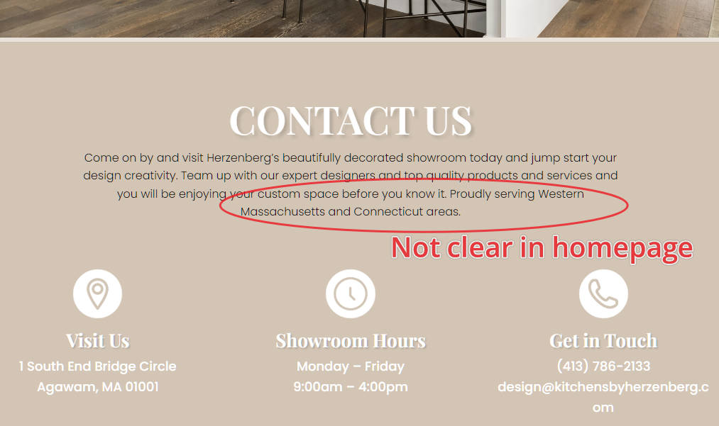
Homeowners planning a kitchen, bathroom, or related residential renovation/new-build project in Western Massachusetts or Connecticut. The geographic scope is explicitly stated on the contact page.
5. Likely primary user goals
Determine whether Herzenberg provides the required remodelling/design service; assess whether the company and its work are suitable for the project; contact the company or request a design consultation.
6. Pages in scope
Homepage and Contact Us / Schedule a Consultation page only.
7. Task Definitions
| # | Task in user language | Starting state | Expected happy path | Observable success |
|---|---|---|---|---|
| T1 | Find out whether Herzenberg can help with my renovation project. | Homepage | Understand the service → establish relevance to the project → decide whether Herzenberg warrants further consideration | User can identify that Herzenberg provides kitchen, bathroom, and related residential design/remodelling services and knows what to do next. |
| T2 | Decide whether Herzenberg serves my area and how I can work with them. | Homepage or Contact Us | Find service/location information → establish geographic relevance → identify an appropriate contact route | User can determine whether their location is likely served and identify how to contact or visit Herzenberg. |
| T3 | Request a design consultation about my project. | Homepage | Recognise consultation CTA → reach Contact Us → provide required contact/project information → send request | Consultation request reaches the point of submission. |
8.a Cold First Impression: Home Page
| Cold-impression question | Assessment | Evidence status |
|---|---|---|
| What is this? | Clear. A luxury kitchen and bathroom remodelling/design business. | Observed |
| Who is it for? | Mostly clear. Homeowners undertaking a remodel or new-home project. The broader service offer becomes apparent further down the page. | Observed |
| What do I do next? | Clear. A request for a consultation is presented immediately after the opening proposition. Service exploration provides a secondary route. | Observed |
| Credible enough to continue? | Strong. The page provides longevity claims, named designers, named product partners, a physical showroom address, a telephone number, and project/service information rather than relying only on promotional claims. | Observed |
8.b Cold First Impression: Contact
| Cold-impression question | Assessment | Evidence status |
|---|---|---|
| What is this? | Clear. Contact and consultation page. | Observed |
| Who is it for? | Clearer than the homepage geographically. Western Massachusetts and Connecticut are explicitly identified. | Observed |
| What do I do next? | Clear. Visit, call/email, or schedule a consultation. | Observed |
| Credible enough to continue? | Adequate to strong. Physical showroom details and direct contact information support legitimacy. | Observed |
9. UX Findings & Severity assessments
Confirmed Severity 3/4 findings: 0
Low-priority findings
| ID | Sev. | Location | Finding | Evidence |
|---|---|---|---|---|
| HOME-01 | 2 | Homepage, opening proposition | Geographic service coverage is absent from the initial service proposition, requiring users to reach “Contact Us” to confirm regional relevance. | Observed |
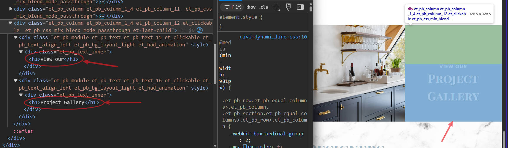
| COMP-01 | 1 | Homepage, heading structure; Contact page, heading structure | “View Our / Project Gallery” appears as two consecutive H1 headings, weakening the semantic document structure. | Observed |
Severity Rating Guide
Severity describes how seriously a usability or accessibility issue affects a user’s ability to complete an important task. It is about impact on task success, not visual quality or ease of fixing.
Severity 1: Cosmetic
Minor issues with no real impact on task completion.
Examples: visual inconsistencies, small alignment issues, wording variations
User impact: none or negligible
Priority: low
Severity 2: Minor
Noticeable friction, but users can still complete the task.
Examples: inefficient interactions, harder-to-find information, unclear wording
User impact: mild friction or uncertainty
Priority: moderate
Severity 3: Major
Serious friction or risk that may affect decisions or task success.
Examples: key information hard to find, accessibility barriers, risk of wrong decisions
User impact: significant
Priority: high
Severity 4: Catastrophic
Blocks the task or causes severe or unrecoverable consequences.
Examples: cannot complete a primary task, inaccessible essential function, data loss risk
User impact: severe
Priority: immediate
10. Accessibility Blockers
| Check | Revised assessment | Severity / status | Evidence |
|---|---|---|---|
| Form fields expose understandable labels | No blocker identified from the current inspection. Programmatic label association has not yet been independently verified. | Unverified | Evaluator inspection |
| Essential controls have understandable names | No blocker identified from the controls inspected. | No finding | Observed |
| Errors identified in text and corrections explained | Validation and post-submission behavior have not been tested. | Unverified | Submission not tested |
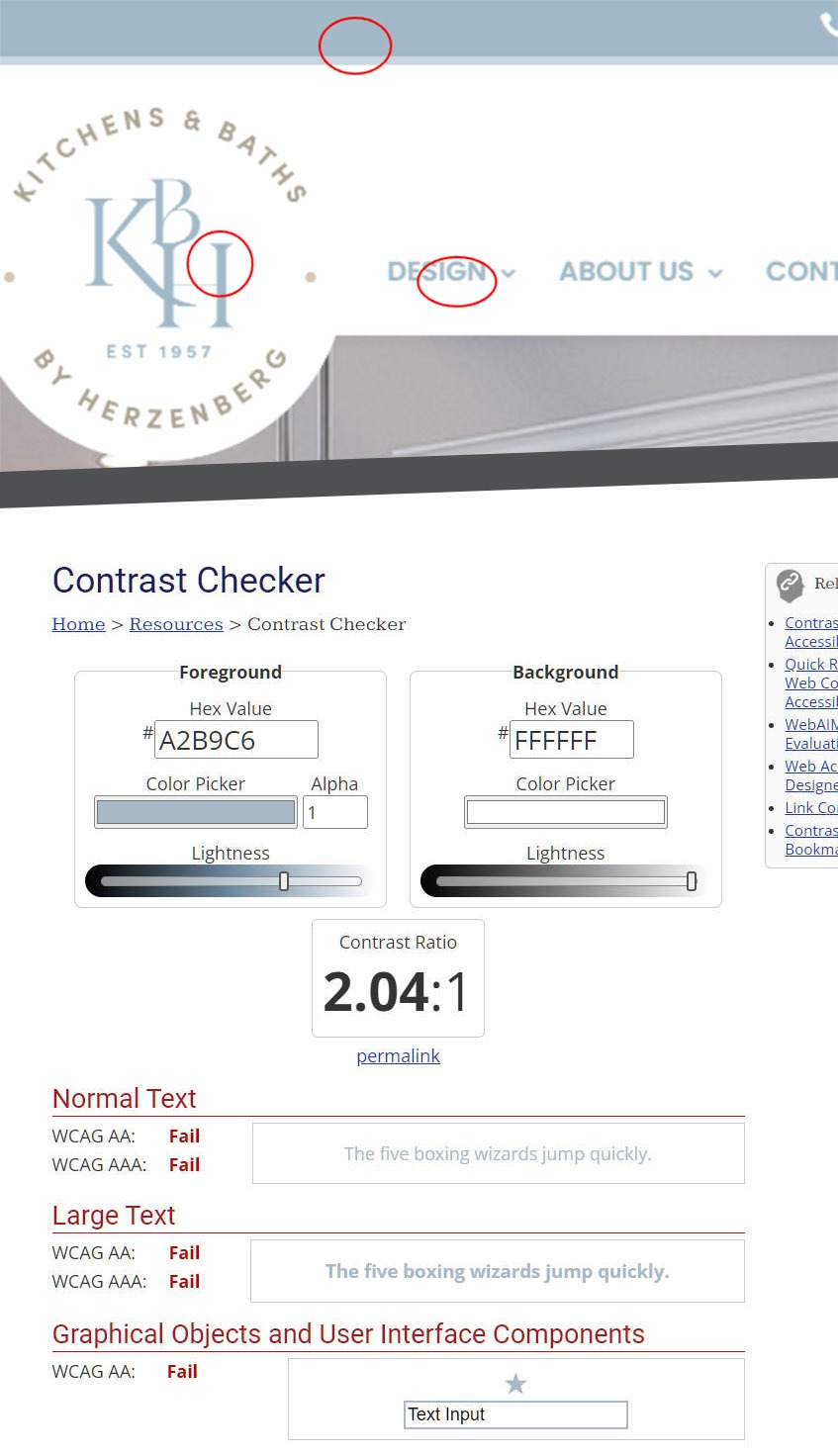
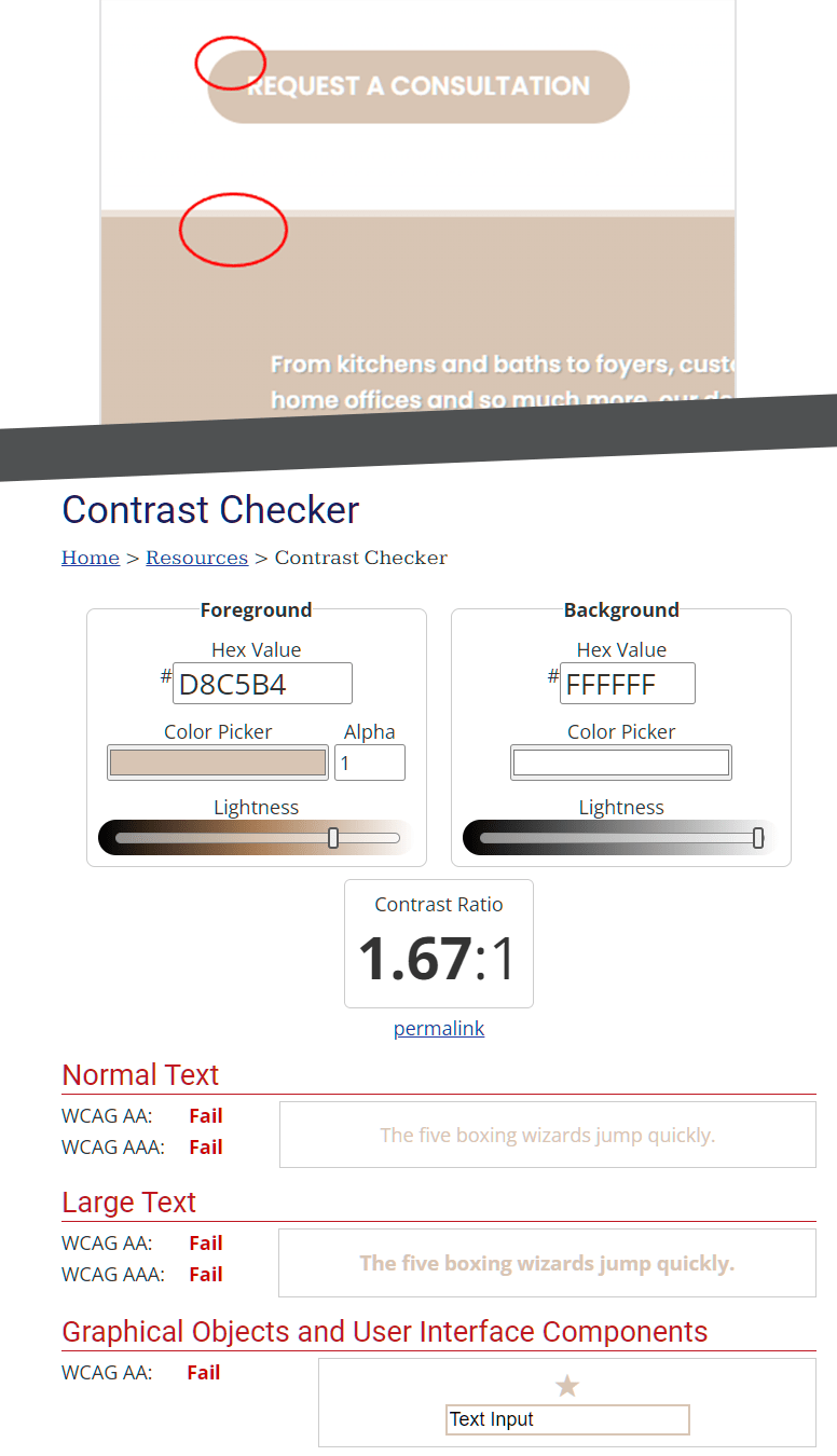
| Text/control contrast | Multiple theme color combinations fail WCAG contrast requirements when paired with white. Reported combinations include #D8C5B4 / #FFFFFF and #A2B9C6 / #FFFFFF. These colors appear in text/background and button treatments. | A11Y-01 · Severity 3 | Supported: designer manual measurement using WebAIM |
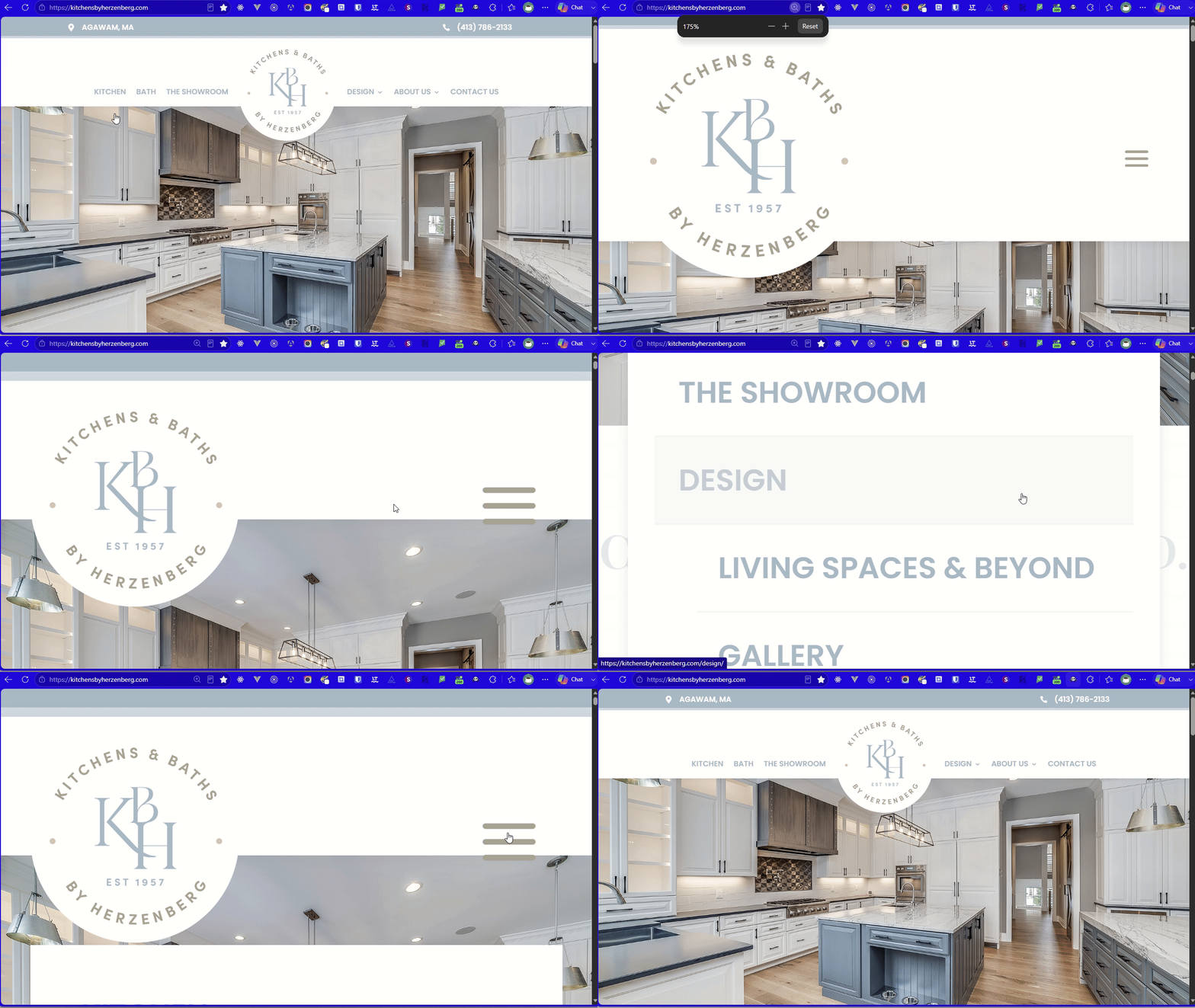
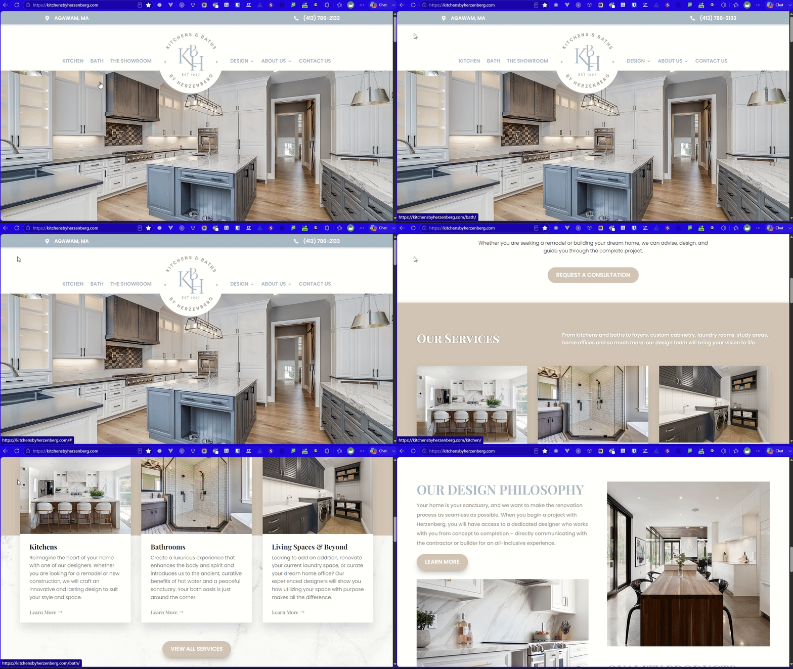
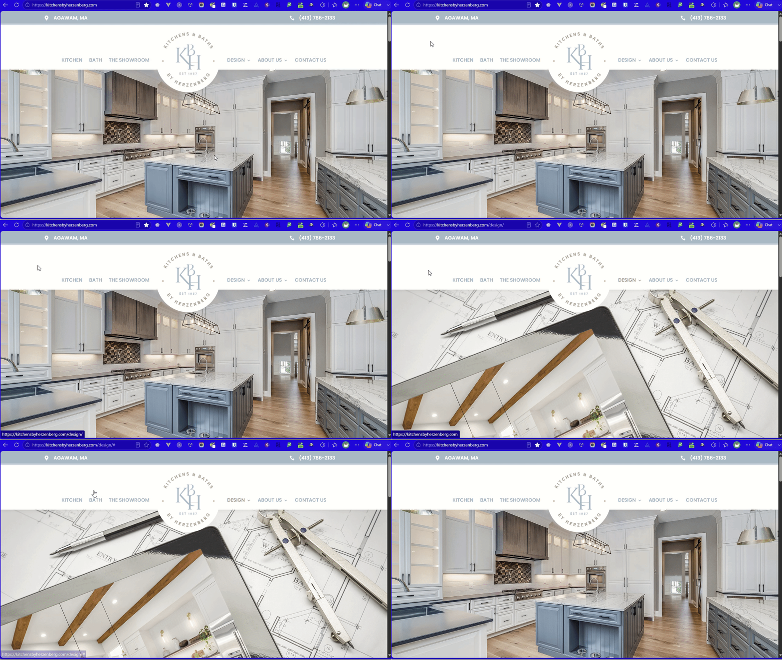
| Keyboard-only completion | Most of the site can be traversed by keyboard, but navigation problems prevent the keyboard experience from being considered fully operable. | Affected by A11Y-02 / A11Y-03 | Supported: designer manual test |
| Visible focus throughout flow | Navigation provides no visible focus indication while tabbing. Keyboard users can move focus without being able to see where it is. | A11Y-02 · Severity 3 | Supported: designer manual test |
| No keyboard trap | No keyboard trap identified during the manual pass. Users appear able to continue navigating away from focused controls. | Pass within tested scope | Supported: designer manual test |
| Dropdown keyboard operation | Tabbing reaches the Design and About Us parent navigation items, but focusing them does not expose their dropdown menus. | A11Y-03 · Severity 3 candidate | Supported: designer manual test |
| Focus unobscured | No evidence yet that a focused element is hidden behind a sticky header, banner, or other overlay. The dropdown issue is an operability problem rather than focus obstruction. | No finding | Designer manual test |
| 400% zoom | No content loss reported. Some elements become visually offset at high zoom, but no task or content failure has yet been established. | Observation only, likely Sev. 1–2 if retained | Supported: designer manual test |
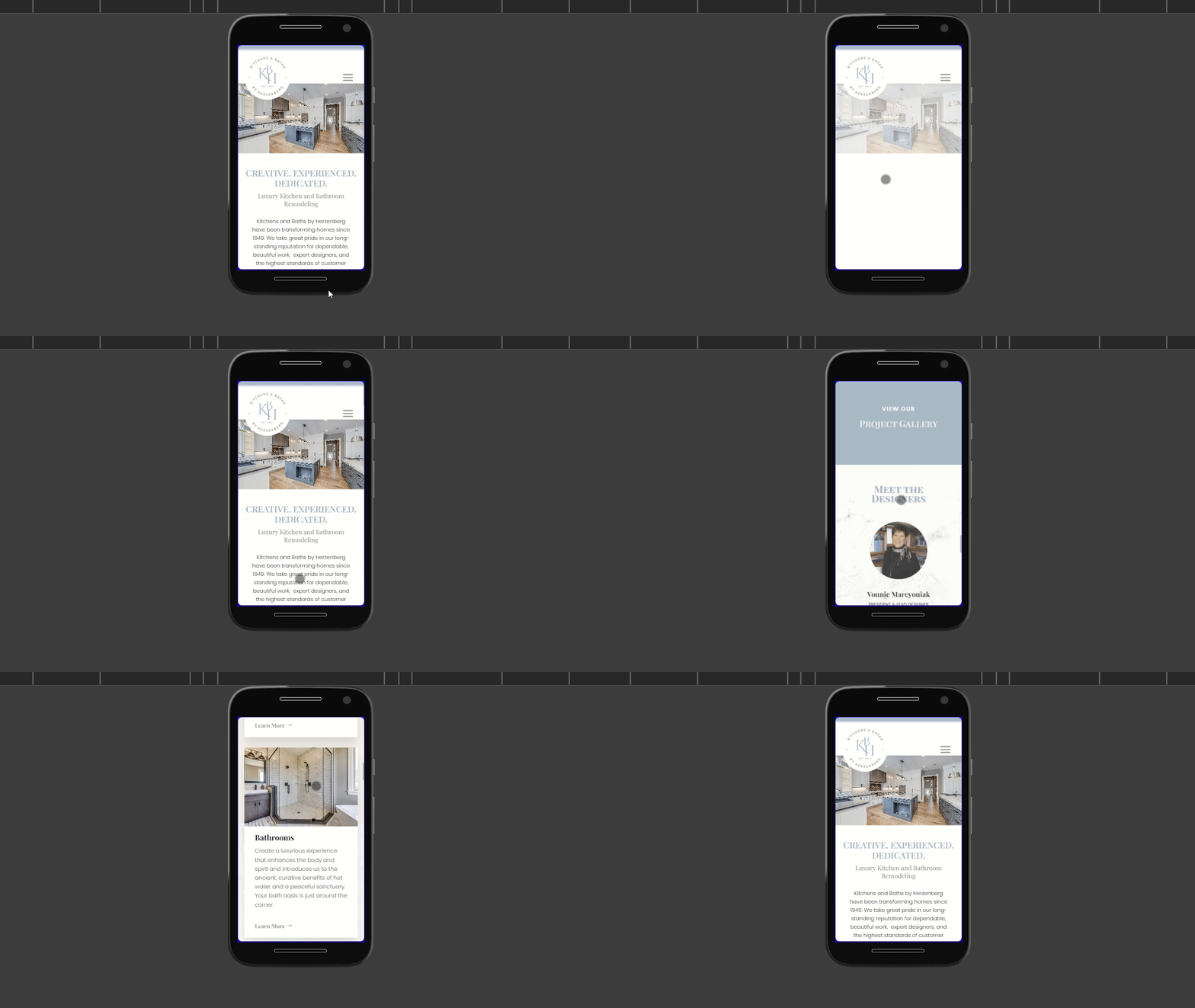
| 320px reflow | No content loss or task-affecting reflow problem identified. | Pass within tested scope | Supported: designer manual test |
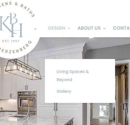
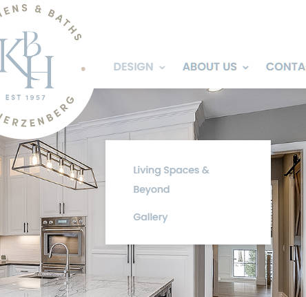
| Mouse dropdown positioning | The Design dropdown appears approximately 50–100px vertically displaced from its navigation trigger, weakening the visual relationship between trigger and menu. | COMP-02 · Severity 2 candidate | Supported: designer manual observation |
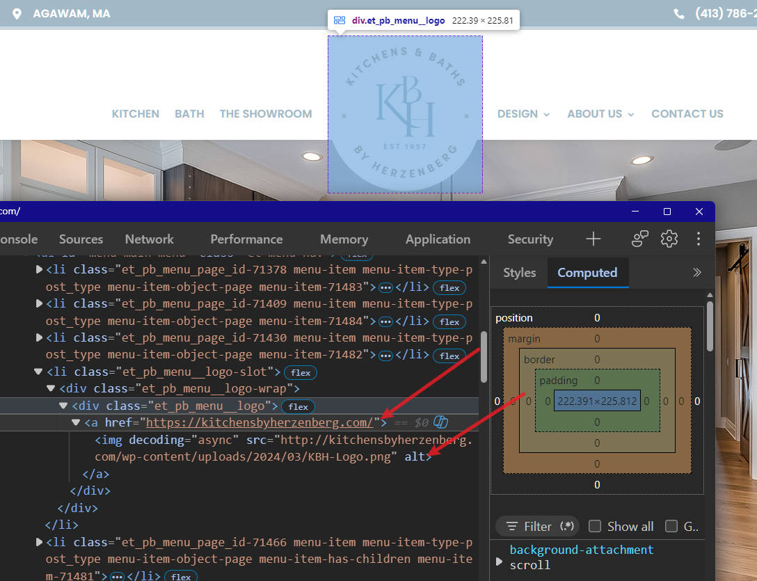
| Image-only links / accessible names | One or more image-only links contain images with alt="" and no apparent accessible textual name. The supplied homepage-logo markup is one example. | A11Y-04 · Severity 3 | Supported: designer markup inspection |
| Image alternative text | Additional images use alt="". Empty alternative text is valid for decorative or redundant images, so each instance requires purpose-based review before a failure is established. | A11Y-05 · Review required | Supported: designer markup inspection |
11. Findability and Decision Content & Content Integrity
PROC-01 · Severity 2 candidate · Observed
(Home page, second section) Prospective clients are asked to book a design consultation before the conversion point itself explains the two engagement models or what happens after the consultation request. Users who want to understand the commitment before making contact may need to find and read the separate process content first.
Recommendation: Don’t duplicate the entire process page. Try to expose enough expectation-setting near the consultation action to answer “What happens when I do this?” and leave the detailed process where it belongs.
Notice: I wouldn’t automatically put PROC-01 in the register. It needs a challenge first. There is a perfectly reasonable argument that people seeking a bespoke kitchen designer expect an initial conversation and don’t need the entire engagement model explained before contacting the company.
COMP-04 · Severity 2 · Observed
The header telephone number lacks a direct calling affordance. The prominent telephone number in the header is not linked, while the corresponding footer number provides an actionable telephone link. This creates unnecessary friction, particularly on call-capable mobile devices.
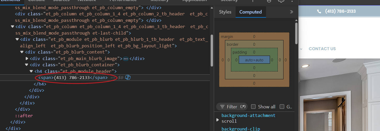
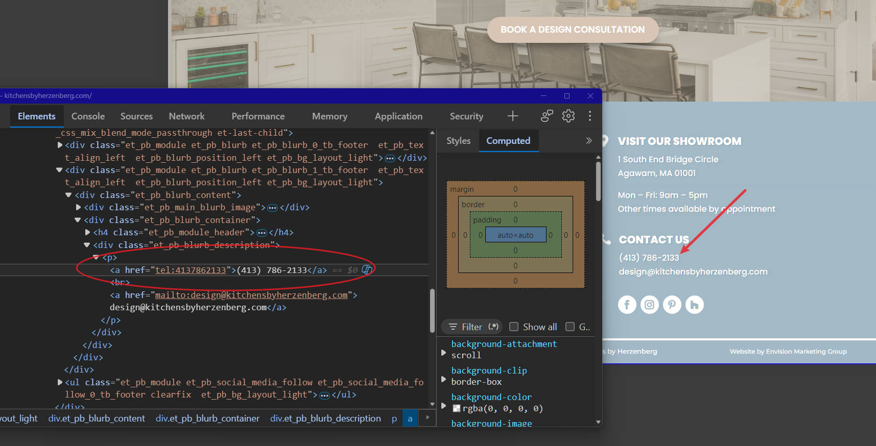
Recommendation: Make the header phone number a tel: link so users on call-capable devices can initiate a call directly.
CONTENT-01 · Severity 2 · Observed
Privacy Policy contains unresolved production placeholders. Published content includes (website address) and the placeholder telephone number XXX YYY-ZZZZ, leaving inaccurate/incomplete contact information in a privacy document.
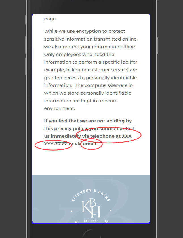
Recommendation: Replace all Privacy Policy placeholders with accurate organization-specific information and review the full policy for any remaining template content.
CONTENT-02 · Severity 2 · Observed
The Accessibility Statement contains content copied from another organization. The published statement identifies excavationplus.net and directs users toward that organization’s customer support rather than Herzenberg.
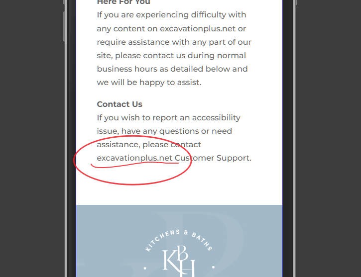
Recommendation: Replace all references to excavationplus.net with accurate Herzenberg information and verify that the Accessibility Statement provides a valid support contact for accessibility assistance.
Findability and Decision Content: Results
Severity 3–4: 0 findings.
Severity 2: PROC-01 candidate, pending review. 2 Content integrity issues found, and 1 component consistency issue.
Findability: healthy within the inspected paths. Notice: CONTENT-01/02 findings can have credible reputational consequences. Placeholder information in a Privacy Policy and another company’s name in an Accessibility Statement can make the site look unfinished, copied, or poorly governed.
12. Technical Blockers
| Check | Assessment | Evidence |
|---|---|---|
| Primary pages load and expose their intended content | Healthy | Observed |
| Consultation route can be reached | Healthy | Observed |
| Broken link or 404 blocks the primary route | No blocker observed | Observed |
| Redirect loop prevents progression | No blocker observed | Observed |
| Layout shift interferes with the conversion control | Pass within tested scope. No task-affecting layout shift observed. Minor movement did not interfere with interaction or obscure the conversion path. | Supported: designer manual observation |
| A slow-loading asset prevents or disrupts interaction | Pass within tested scope. No disruptive loading behavior observed. The pages remained responsive and usable when throttled to a 3G connection. | Supported: designer manual test under 3G throttling |
| Form successfully submits | Unverified | Production submission not authorised |
| Post-submission state functions correctly | Unverified | Production submission not authorised |
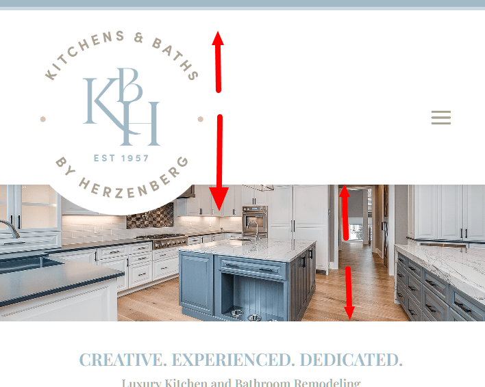
| Responsive navigation sizing | Observed. At tested tablet sizes and approximately 320–480px mobile widths, the brand mark occupies a disproportionate amount of available navigation space. No control obstruction or task blockage was established. | COMP-03 · Severity 2, supported by designer responsive testing |
| Dropdown positioning | Observed. During mouse interaction, the Design dropdown appears substantially vertically displaced from its parent navigation item, weakening the spatial relationship between trigger and menu. | COMP-02 · Severity 2 provisional, supported by designer observation |
| Header telephone interaction | Observed. The prominent header telephone number is not actionable, while the equivalent footer treatment provides a direct telephone link. This creates avoidable friction for users initiating a call, particularly on mobile. | COMP-04 · Severity 2, supported by designer manual test |
13. Risk Register and Fix Order
Findings are prioritized according to their effect on task completion, accessibility, decision-making, and recoverability.
| ID | Area | Finding | Severity | Evidence | Recommendation |
|---|---|---|---|---|---|
| A11Y-01 | Colour contrast | Theme color combinations using #D8C5B4 and #A2B9C6 against #FFFFFF fail applicable contrast requirements in tested text and control treatments. | 3 Major | Supported: designer manual measurement using WebAIM Contrast Checker | Establish accessible variants of the affected theme colors and verify each foreground/background combination against the applicable WCAG contrast threshold. |
| A11Y-02 | Keyboard focus | Navigation provides no visible focus indication while users move through it using the keyboard. | 3 Major | Supported: designer manual keyboard test | Provide a persistent, clearly distinguishable focus indicator for all keyboard-focusable navigation controls. |
| A11Y-03 | Keyboard navigation | Keyboard focus reaches the Design and About Us parent navigation items but does not expose their dropdown menus. | 3 Major – provisional | Supported: designer manual keyboard test. Availability of equivalent keyboard-accessible routes remains unverified. | Make dropdown navigation keyboard operable and verify that all submenu destinations can be reached and exited using standard keyboard interaction. |
| A11Y-04 | Accessible names / functional images | Some image-only links use images with empty alt attributes and provide no other apparent mechanism for communicating the link’s purpose. | 3 Major | Supported: accessibility-tool detection and designer markup inspection | Give image-only links meaningful accessible names that communicate their function or destination. Do not rely on title attributes as the primary remediation. |
| CONTENT-01 | Privacy Policy | The published Privacy Policy contains unresolved production placeholders, including (website address) and XXX YYY-ZZZZ. | 2 Minor | Observed / verified on production page | Replace all placeholders with accurate organization-specific information and review the complete policy for remaining template content. |
| CONTENT-02 | Accessibility Statement | The published Accessibility Statement contains content belonging to another organization, including references to excavationplus.net and its customer support. | 2 Minor | Observed / verified on production page | Replace copied references with accurate Herzenberg information and verify the complete statement, including the accessibility-assistance contact route. |
| PROC-01 | Decision content | Important expectation-setting information about the consultation process and engagement models is separated from the immediate consultation decision. | 2 Minor | Observed | Provide concise expectation-setting near the consultation action while retaining detailed process information on the dedicated process page. |
| COMP-03 | Responsive navigation | At tested tablet and approximately 320–480px mobile widths, the full brand mark requires disproportionate navigation space to remain recognizable; reducing it sufficiently would compromise brand legibility. | 2 Minor | Supported: designer responsive testing | Develop an approved compact/responsive logo variant for constrained navigation contexts while retaining the full brand mark where adequate space is available. |
| COMP-04 | Contact affordance | The prominent header telephone number is not directly actionable, while the corresponding footer number provides a telephone link. | 2 Minor | Supported: designer manual test | Make the header telephone number a tel: link so call-capable devices can initiate the contact action directly. |
| COMP-02 | Navigation presentation | During mouse interaction, the Design dropdown appears substantially displaced from its parent navigation item. The menu remains usable, but the offset weakens its visual relationship to the trigger. | 1 Cosmetic | Supported: designer manual observation | Align the dropdown more closely with its parent navigation item. |
| COMP-01 | Semantic structure | The shared Project Gallery component represents the visually unified “View Our Project Gallery” title as two separate H1 elements. | 1 Cosmetic | Observed | Represent the title as one meaningful semantic heading and handle the split visual treatment through presentation. |
Accessibility Items Requiring Further Review
Not every automated accessibility warning constitutes a failure. Findings were retained only where the surrounding context supported them.
Images using alt="" should be reviewed according to their purpose. Empty alternative text is appropriate for decorative or redundant images.
Functional images require particular attention. Where an image is the only content of a link, the resulting link must expose a meaningful, accessible name.
14. Fix Order
1. Restore keyboard access and visible focus: A11Y-02 / A11Y-03
Correct the shared navigation so keyboard users can identify current focus and operate the dropdown menus. Verify every submenu destination during retesting.
2. Correct inaccessible colour combinations: A11Y-01
Revise affected theme applications and verify actual contrast ratios for text, controls, and interactive states against the applicable WCAG thresholds.
3. Correct unnamed functional links: A11Y-04
Prioritize image-only navigation and functional links that do not expose meaningful accessible names. Verify corrections through the computed accessibility tree.
4. Correct production policy and accessibility content: CONTENT-01 / CONTENT-02
Remove unresolved template content and references to unrelated organizations. Review both pages in full rather than correcting only the individual strings already discovered.
5. Improve responsive navigation branding: COMP-03
Provide a compact brand treatment appropriate to constrained navigation contexts rather than forcing the full logo into dimensions where it becomes either disproportionately large or unrecognizable.
6. Reduce consultation and contact friction: PROC-01 / COMP-04
Provide concise consultation expectation-setting near the conversion action and make the prominent header telephone number directly actionable.
7. Resolve presentation and semantic cleanup: COMP-02 / COMP-01
Correct the dropdown alignment and Project Gallery heading structure after higher-consequence accessibility and task issues have been addressed.
Implemented Recommendations
View the prototype of the KitchensByHerzenberg.com website with the accessibility and UX remediation recommendations applied.