
A while ago, I made this YouTube Short telling you how Figma projects get slower and slower. I also promised I would drop the full methodology here, so you don’t have to sit there watching a frozen screen while your laptop fan tries to achieve liftoff.
Figma doesn’t usually slow down out of nowhere. What happens is quieter, more insidious. Files start fine. Then they grow. Then they grow carelessly. You add more components, more variants, more nesting, and more “just in case” flexibility. At some point, the file starts lagging, edits feel sticky, and everyone blames the hardware or the browser.
But most memory issues in Figma aren’t bugs: they’re design decisions.
I have a hunch on why designers make these mistakes. Most of us come from a Graphic Design background (Adobe Illustrator/Photoshop) or a Frontend background (React components). We drag those mental models into Figma, assuming layers are free or abstraction is always better. That is where it goes wrong.
It’s not about perfection, but it borders about survival at scale. Here are the prominent ten tips on what actually causes memory breakdowns and how to avoid them without neutering your design system.
Most of us (designers) come from a Graphic Design or a Frontend background. We drag those mental models into Figma, assuming layers are free or abstraction is always better.
1. Control variant growth early
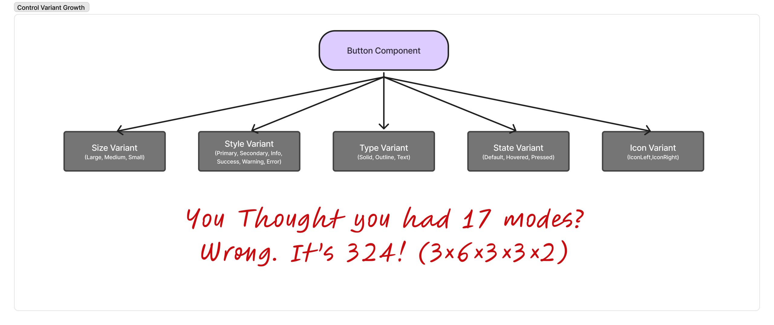
Do not create more variants on a single component just because you can. Variants don’t scale linearly: they scale combinatorially. A component with 3 sizes, 3 states, and 2 styles doesn’t have 8 variants. It has 18 . Add an icon toggle? You are at 36. Nothing feels wrong yet, and that is the trap. Figma loads all variants even if you only use a few. Once variant counts creep past 25–30 per component, you pay the memory cost everywhere that component exists.
What you shouldn’t do:
- Create a “Button” component.
- Add Property: Size (Small, Medium, Large).
- Add Property: State (Default, Hover, Pressed).
- Add Property Type (Solid, Outlined, Text).
- Add Property: Style (Primary, Secondary… Success, Error… etc).
- Add Property: Icon (Left, Right).
What you should do:
- Treat variants as identity changes only.
- Identify optional elements (like the Icon).
- Convert the “Icon” variant axis into a Boolean property.
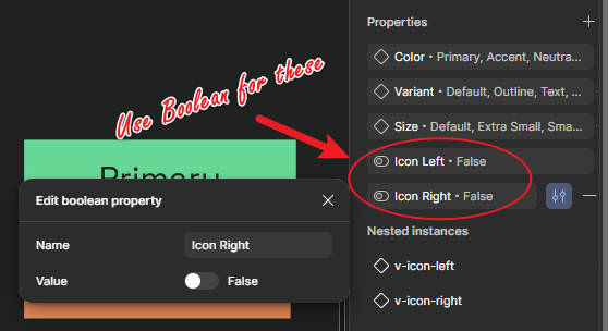
Result: Variant count drops significantly; visibility is handled by properties, not separate component states.
2. Keep variant sets shallow
Do not nest variants inside variants. You can’t technically create a variant inside a variant, but you can nest a component that has its own set inside another. That is where things go sideways. If you have a Button variant containing an Icon variant, every button has to resolve every icon state . That creates variant trees, not lists. Figma now has to resolve parent state, child state, and track dependencies . One decision layer is manageable. Decision layers inside decision layers explode complexity.
What you shouldn’t do:
- Create an “Icon” component with variants: Glyph, Weight.
- Nest this “Icon” inside a “Button” component.
- Give the “Button” its own variants: Size, Type.
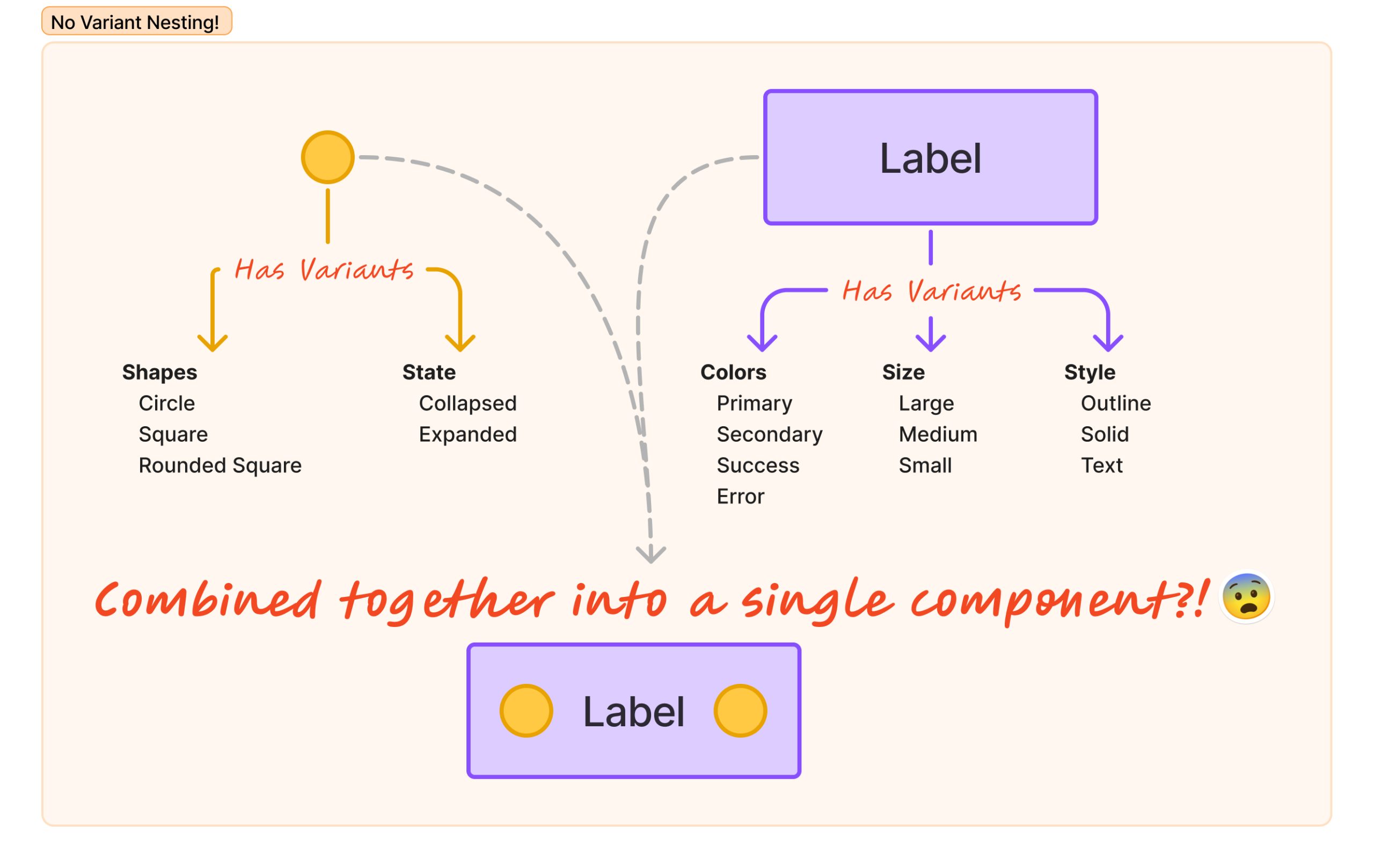
What you should do:
- Keep the variant set flat.
- Ensure nested components are stable or minimally variable.
- Maintain one configurable variant set per component.
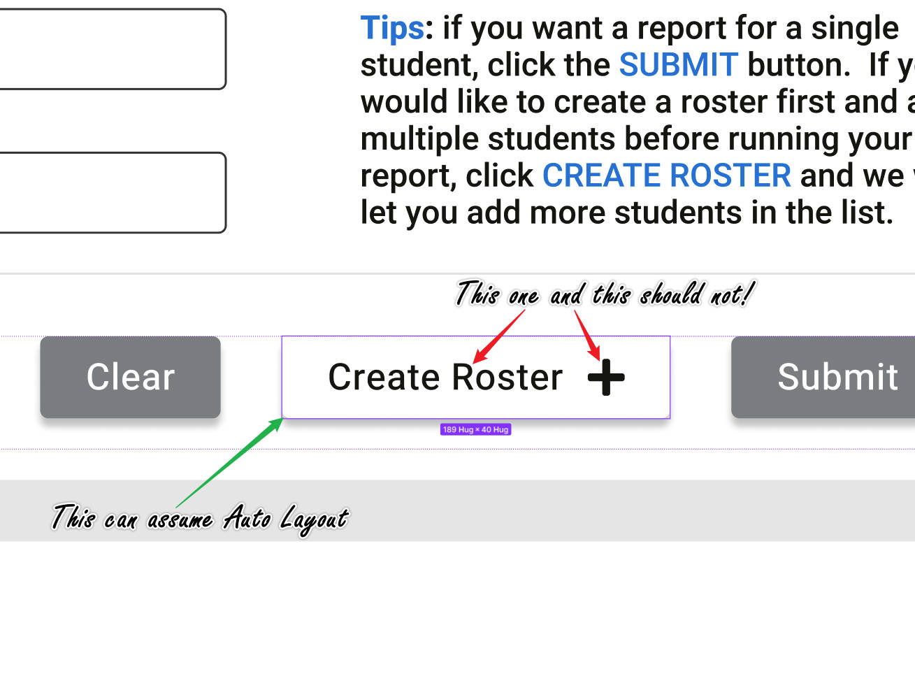
3. Use Boolean properties for conditional UI, not variants
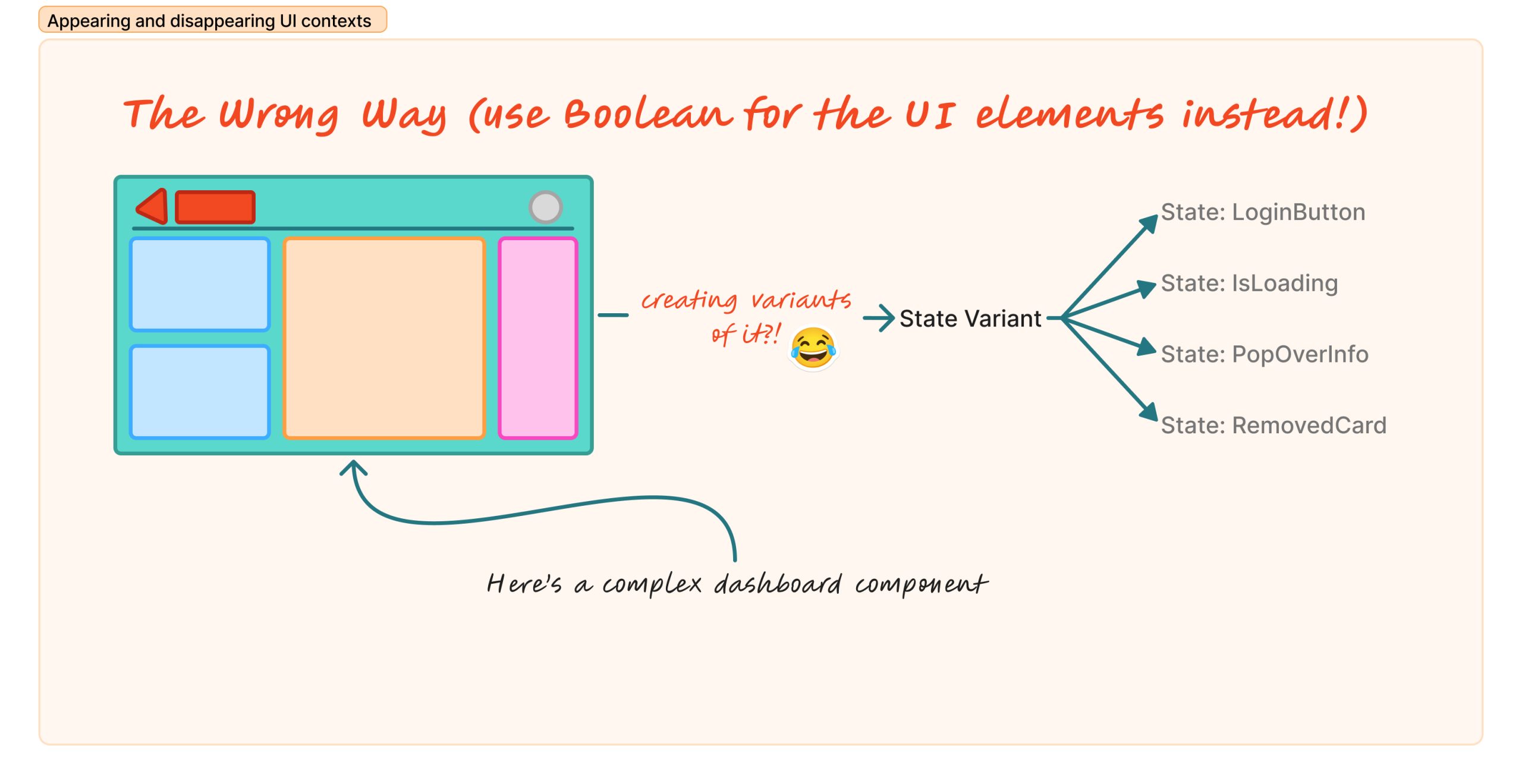
This is the single most common misuse of variants. If the question is “Is this thing present right now?”, that is a Boolean. Things like icons, loading spinners, popovers, or badges – they don’t change what the component is. They change what is currently true about it. Using variants for these doubles or triples your count for no semantic gain.
What you shouldn’t do:
Say, you have a dashboard UI, and you thought this dashboard should have “states”. You:
- Create a variant for “Default“.
- Create a variant for “With Icon“.
- Create a variant for “With Badge“.
- Create a variant for “Loading State“.
What you should do:
- Keep all layers (Icon, Badge, Spinner) present in the main component.
- Bind the layer’s visibility to a Boolean property (e.g., “Show Icon”: True/False).
- Bonus: Let Auto Layout handle the spacing closure when the element is hidden.
4. Be disciplined about nesting
Nesting isn’t free. Each nested component increases the recalculation cost across every instance. But the real cost isn’t just about Auto Layout math; it’s about dependency depth.
When you nest an instance inside a component, you are creating a dependency chain. If Component A contains an instance from Library B, and that instance contains an atom from Library C, you aren’t just stacking boxes. You are building a supply chain. Every time something changes (a text override, a visibility toggle, or a swap) Figma has to walk that entire chain to validate the layout.
If your UI elements are 12 layers deep across multiple libraries, you are asking Figma to resolve a complex graph just to render a checkbox.
What you shouldn’t do:
- The Deep Chain: Create an “Atom” in Library A.
- Nest it inside a “Molecule” in Library B.
- Nest that inside an “Organism” in Library C.
- Place that “Organism” inside a “Template” in your Project File.
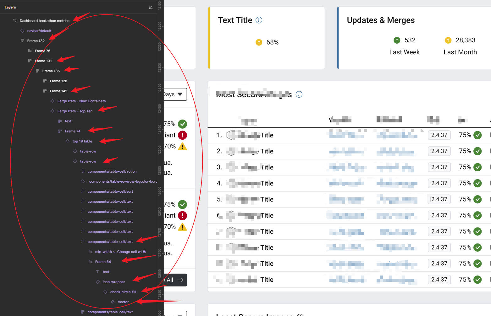
What you should do:
- Flatten the Hierarchy: Compose complex organisms locally in the product file using atoms and molecules, rather than pre-baking everything into one deep library component.
- Detach Trivial Nests: If a wrapper component adds no value other than “grouping,” get rid of it.
- The Rule: Keep your dependency chains as shallow as possible. If you need a map to find the bottom layer, it is too deep.
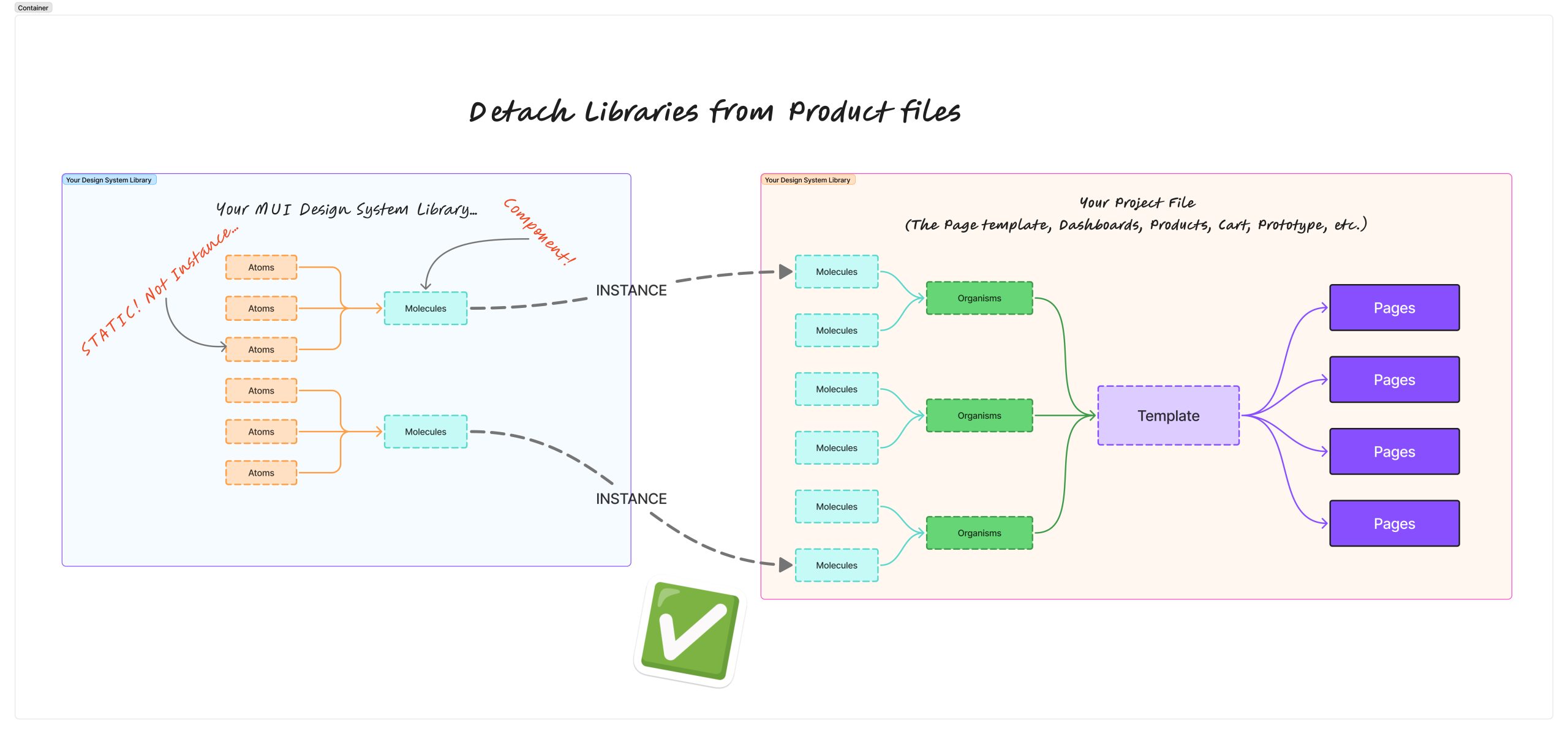
5. Separate libraries from product files
Copying pages of instances between files drags entire dependency trees along. When a file consumes a library component, it loads the full component, all nested components, all variants, and all property bindings . If your library component is heavy, every file that uses it pays the cost. Libraries don’t amortise memory across files; each file loads its own copy of the graph.
What you shouldn’t do:
- Create a “Project A” file.
- Build the master components inside “Project A”.
- Design the screens inside “Project A”.
- Duplicate “Project A” to start “Project B”. 😅
What you should do:
- Create a dedicated Library file: Atomic, lean, boring.
- Create a separate Product file: Screens, flows, composition.
- Never put screens in the library file.
6. Avoid large, unused variant sets in libraries
Figma loads the whole component, not just what is used. This is subtle and dangerous. If a library component has 100 variants and your product file uses 5, Figma still loads all 100. There is no lazy loading per variant. “Future-proofing” variant sets in libraries costs memory immediately and affects every consuming file.
What you shouldn’t do:
- Build a “Super Button” in your library with 100+ variants for every conceivable use case… “just in case“.
- Import this library into a small project that only needs the primary and secondary buttons.
- Watch the memory usage spike because the file loaded the other 98 dead variants.
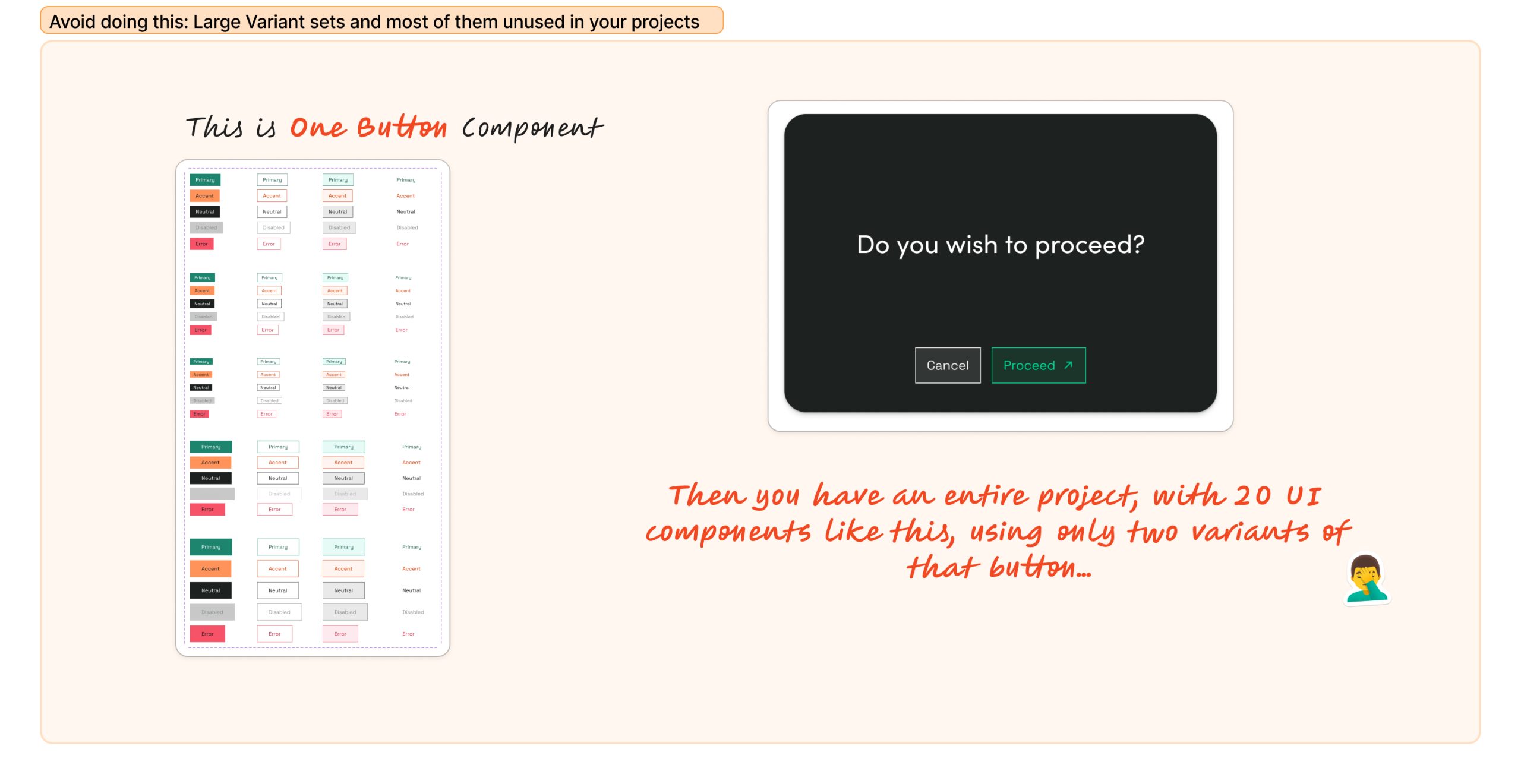
What you should do:
- Ship only variants that are actively used.
- Split niche, rarely used variants into a secondary library.
- Archive dead variants; do not hoard them.
7. Be cautious when swapping instances at scale
Instance swapping feels cheap until it isn’t. Every swap forces Figma to search enabled libraries, resolve compatibility, and rebind dependencies. Common misuse includes swapping button components instead of using variants or swapping list rows repeatedly across screens. It is fine occasionally, but expensive when it is your primary state system.
What you shouldn’t do:
- Create Button/Primary, Button/Secondary, and Button/Destructive as separate components.
- Place Button/Primary in a design.
- Use the “Swap Instance” menu to change it to Button/Destructive every time you need a state change.
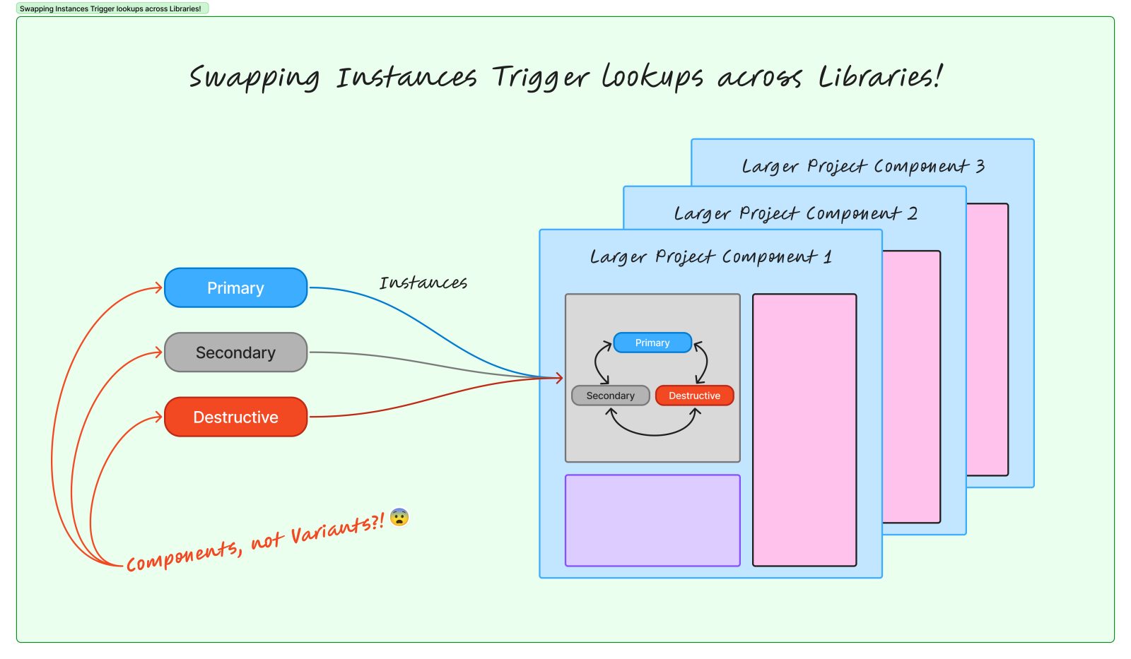
What you should do:
- Use variants for identity changes (select “Destructive” from the variant dropdown).
- Use Booleans for optional UI.
- Reserve instance swaps for intentional, infrequent composition changes.
8. Watch Auto Layout misuse
Auto Layout is a constraint solver. Deeply nested hug-hug-hug chains cause cascading recalculations. Every nested Auto Layout with “Hug” introduces another recalculation layer. This gets especially bad when static content is wrapped unnecessarily, or every container hugs “just in case”. This problem is commonly compounded by undisciplined nesting, which we explained up there in Number 4.
What you shouldn’t do:
- Create a text layer.
- Wrap it in a Frame (Auto Layout + Hug).
- Wrap that in another Frame (Auto Layout + Hug).
- Wrap that in a third Frame (Auto Layout + Hug) “just in case” you need padding later.
What you should do:
- Use Auto Layout only where content actually changes.
- Flatten the hierarchy where constraints aren’t needed.
9. Prune hidden layers
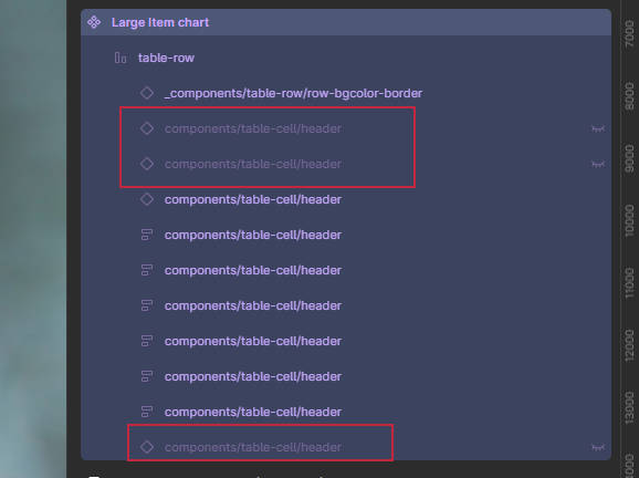
Hidden-by-default is fine. Hidden-forever is dead weight. Hidden layers still exist: they consume memory, participate in layout, and complicate reasoning . If you are stacking hidden states instead of using properties, you are accumulating invisible complexity.
What you shouldn’t do:
- Keep an old version of a UI element inside the component.
- Hide it by clicking the “Eye” icon.
- Leave it there forever “for reference” or “just in case we revert“.
What you should do:
- Use Booleans if the visibility is conditional logic.
- Delete layers if they are deprecated.
- If it will never be shown again, destroy it [1].
10. Accept that some duplication is healthier than abstraction
Two simple components often cost less than one hyper-abstracted monster. This is the hardest rule to accept. The anti-pattern is the “Universal” component with dozens of Booleans and multiple variant axes, where most layers are hidden most of the time. It feels elegant, but it performs terribly.
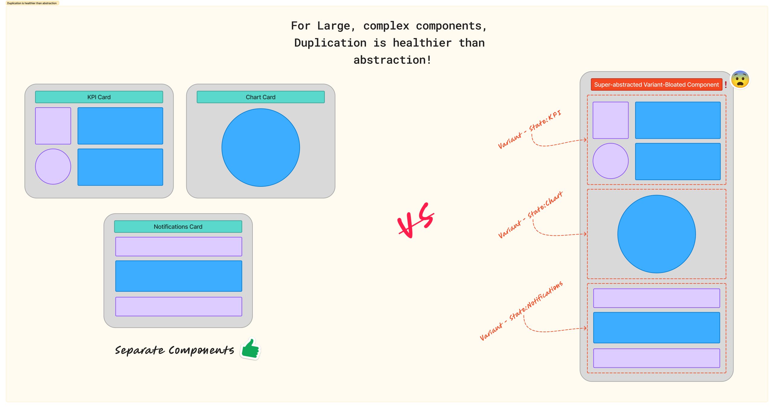
What you shouldn’t do:
- Create one “Universal Card” component.
- Add slots for Header, Subhead, Media, Actions, Comments, and Metadata.
- Add logic to hide 90% of these slots depending on the context.
What you should do:
- Create separate components (e.g., “Media Card“, “Comment Card“).
- Link them via shared styles.
- Keep the logic minimal within each specific component
Footnotes
- There is a distinction between just deleting a layer and destroying (obliterating) a component. Deleting is local; it clears the canvas. Destroying is global; it means expunging it from the source library so it stops haunting your dependency graph. ↩︎