The 9-to-5 had run its course. Not the work. The shape of it. Almost twenty years in IT, frontend development, UX, and the strange territory where all three get dumped into the same Jira ticket. Government platforms. Healthcare systems. Enterprise dashboards people use because leaving the company would be more inconvenient.
So I took a proper break and asked what I would build if nobody else controlled the roadmap.
The lazy answer was freelancing. Make a portfolio, print business cards, accept every project, and somehow end up writing a dentist’s Facebook post for National Root Canal Appreciation Week.
No.
I am building Logias as a small UX consultancy. Accessibility assessment and remediation will be the main service. UX and frontend development will follow when the audit reveals that the real problem is the workflow, the content, the interface, the code, or all four having a fight in production.
The logo held me back for longer than it should have. This is what happens when a designer becomes his own client. Every idea gets reviewed, rejected, reopened, adjusted by two pixels, and reviewed again by the same idiot.
Then, voilà.
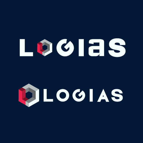
The Logias symbol is a pseudo-four-dimensional cube built with perspective complexity. The red section forms a three-dimensional L. The grey or white section, depending on the theme, completes the cube-like loop into an O. Together, the mark contains the first two letters of LOgias without simply writing “LO” inside a hexagon like I had run out of ideas.
That is the proper explanation.
At a quick glance, however, it looks like a hexagon with a gaping hole.
The identity uses white as its primary background and very dark navy for dark mode. Yellow is the ornamental colour: rules, bullets, markers, small accents, and the occasional alternate background when the light theme needs something louder than white.
The logo has two colour variants for the same reason. The darker construction is designed for light backgrounds. The lighter grey and white construction is designed for dark backgrounds. It is not a decorative swap. Each version preserves the shape, contrast, and depth of the mark in its intended theme.
Then came the wordmark.
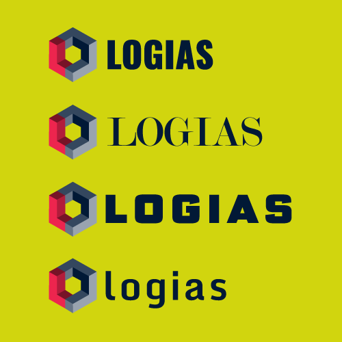
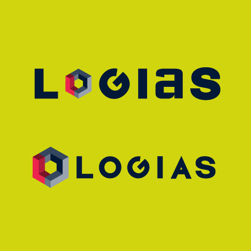
I tried the symbol inside the name. I tried it beside the name. I tested wide geometric lettering, condensed lettering, an elegant serif, a chunky science-fiction typeface, and a friendly lowercase option that looked as though Logias might sell ethically sourced notebooks.
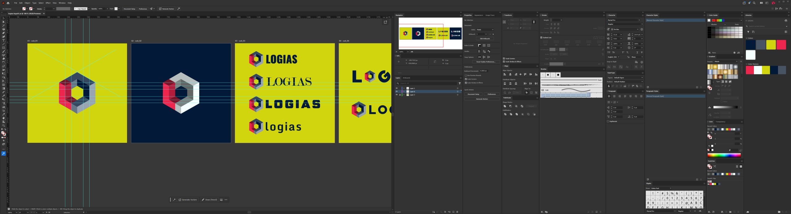
The fifth image is basically a police line-up for fonts.
One looked like a newspaper. One looked like a military contractor. One looked like a 1987 arcade machine. One looked like an app that reminds you to drink water.
This is apparently design research when you own the company.
For the website, Drupal 11 will handle the backend and content. Next.js and TypeScript will handle the frontend. Next-Drupal will connect them. Drupal gets to organise the pages, case studies, services, and articles. Next gets to make them fast, accessible, and pleasant to use.
Version one will stay small: home, services, work, teardowns, about, contact, and an accessibility statement. No empty press room. No fake careers page. No photograph of six strangers laughing at a laptop.
The site also has to demonstrate the work. Proper semantics. Keyboard navigation. Visible focus. Sensible contrast. Accessible forms. Screen-reader testing. Good performance. If the Logias website fails when somebody presses Tab, I will quietly delete the company and become a landscape gardener.
The business itself will remain equally narrow. Accessibility first. UX and development where needed. No overlays. No rubber-stamp audits. No social media management. No native app promises because somebody mentioned one during a call.
That is where Logias stands now.
The name is sorted. The logo finally exists. The colours have stopped arguing with me.
Now I have to build the bloody website.