This is the SafenestCoffee.org Usability testing and UX Critique. I was consulted to do Usability testing and User Experience Study for a non-profit that was promoting a Coffee e-commerce side business that will benefit victims of domestic abuse. To learn more about SafeNest, please go to SafeNest.Org.
Because they wanted to see what I have to do first, and they needed leeway to hire the proper consultant to revamp the site, the Critique needed to be done in private first before I could publish it. Once they have started the consultation, I can publish this publicly. This was done pro-bono. I’m not making a single cent from it. (Publication Date: 2023-May-30).
When conducting Usability Testing, there are many methods to use, but I like to start with the 1994b version of the Nielsen 10 Usability Heuristics.
Nielsen 10 Usability Heuristics
The Nielsen 10 usability heuristics, developed by Jakob Nielsen, are a set of guidelines for evaluating the usability of user interfaces. The goal is to perform Heuristic evaluations on the website in question.
For each of the 10 Heuristic evaluations, a maximum of 10 points will be given, which should total over 100 points. If an evaluation criterion does not apply to the website, appropriate adjustments to the point system will be made.

I: Visibility of session status (Score 0/10)
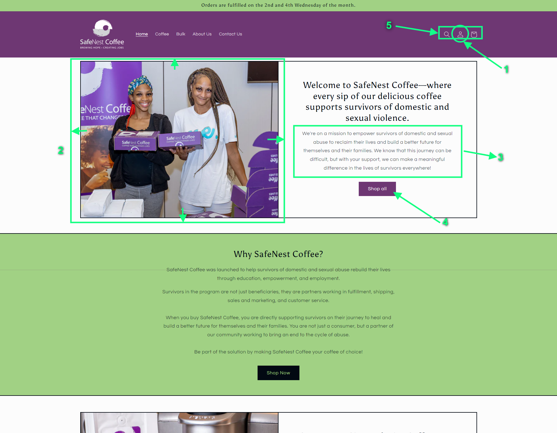
When signed in as an ordering customer, there is no visible status whether one is signed in or not. The icon on the top right side is the same whether the user has an active session or an anonymous visitor.
II: understandable elements in the site (6/10)
Buttons match their intended banner, however redundant. E-commerce items are in their familiar form. However, there are no hover tooltips on icons that don’t have labels on them.
III: User Freedom to Return and back out (5/10)
Appropriate ways to back out of things you didn’t mean to go to are available. 404 pages aren’t designed very well, but it doesn’t get the user stuck. Appropriate ways to return to a previous page are present. Return to cart is not immediately visible, though. Top Navigation doesn’t reveal itself as sticky if you don’t scroll up. Otherwise, No significant issues.
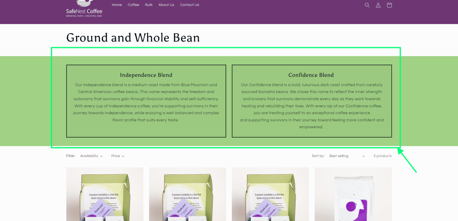
IV: Consistency (0/10)
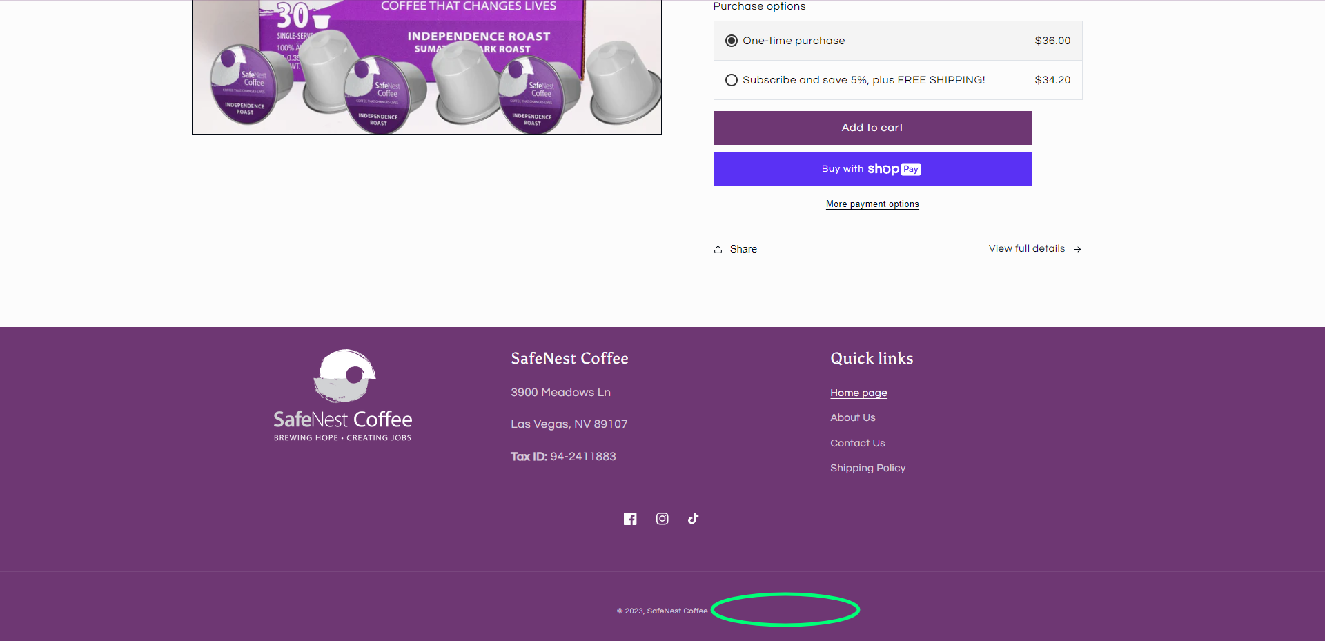
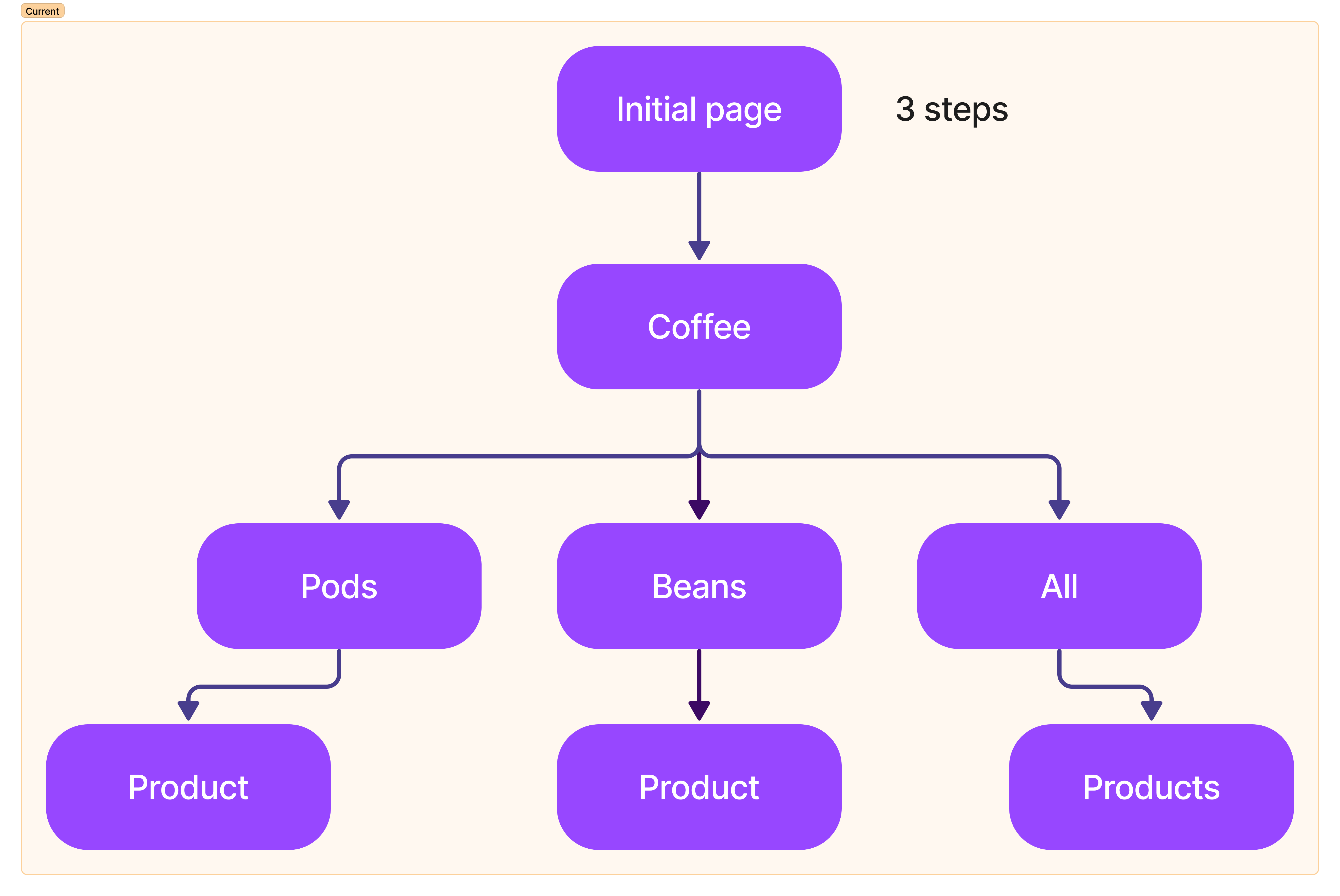
An example of inconsistency is on the product page (called “Coffee” on the site). For the three subpages of the “Coffee” page, “Coffee Pods”, “Beans”, and “Shop All”, their landing pages are different from each other (see below):


V: Preventing errors from happening in the first place (4/10)

… “What Format?” There was no instruction as to which phone number “format” to adhere to. Phone numbers should be parsed in the backend into a consistent format, in this way, people can enter any kind of phone number format and it will be accepted. Otherwise, if the phone number only accepts a certain format, what is it? Where is the instruction, or example?
VI: Recognition rather than recall (3/10)
Because of the inconsistency of the product pages, lack of appropriate placeholders or instructions on the contact page, the hover images inconsistent, and the lack of visible active sessions, it will be difficult for people to have a good experience with their browsing because the elements are unrecognizable they will have to “recall” things to get around.
VII: Flexibility and efficiency to use (Not applicable)
This step of the heuristic evaluation did not apply to the SafeNest Coffee site. Number VII of the Nielsen 10 Usability Heuristics states that a good system must be flexible and efficient for different levels of expertise. “Accelerators” or “Shortcuts”, unseen by the novice user, may often speed up the interaction for the expert user, such that the system can cater to both inexperienced and experienced users. Allow users to tailor frequent actions.
An example of this is Adobe Illustrator’s feature to have a customisable Workspace. Most Novices need most of the GUI tools that serve them very well. On the other hand, experts will not need all the devices present on the GUI and will prefer a minimalist workspace and almost free of UI buttons. This flexibility of an application helps address the individual needs of different users.
VIII: Aesthetic and Minimalist Design (0/10)
Redundant Call-to-Actions, unnecessary subpages for product categories when there’s already a “Shop All”, and the point or messaging on the front page is very hard to spot by speed surfers on the site.
IX: Recovering from errors (3/10)
Since there was no thorough testing done with the shopping mechanism, I wouldn’t delve much into the evaluation for this criterion, however, the determination for this is relevant to Heuristic Evaluation #5.
X: Documentation, Help, and Technical Support (NOT applicable)
While there is a “Contact Page” and a phone number listed in the footer as a means of reaching out for support, documentation is irrelevant to the website. This is not a Software as a Service nor a web application type of website.
Overall, the Nielsen 10 heuristic score of the site is 21% out of 100%. This is based on the calculated average of all the points and graded as a percentage. (0, 6, 5, 0, 4, 3, 0, and 3).
Other Issues
I’m going to expand more on my testing:
- Unknown User Session Status (users wouldn’t know if they’re signed in. Addressed in part I)
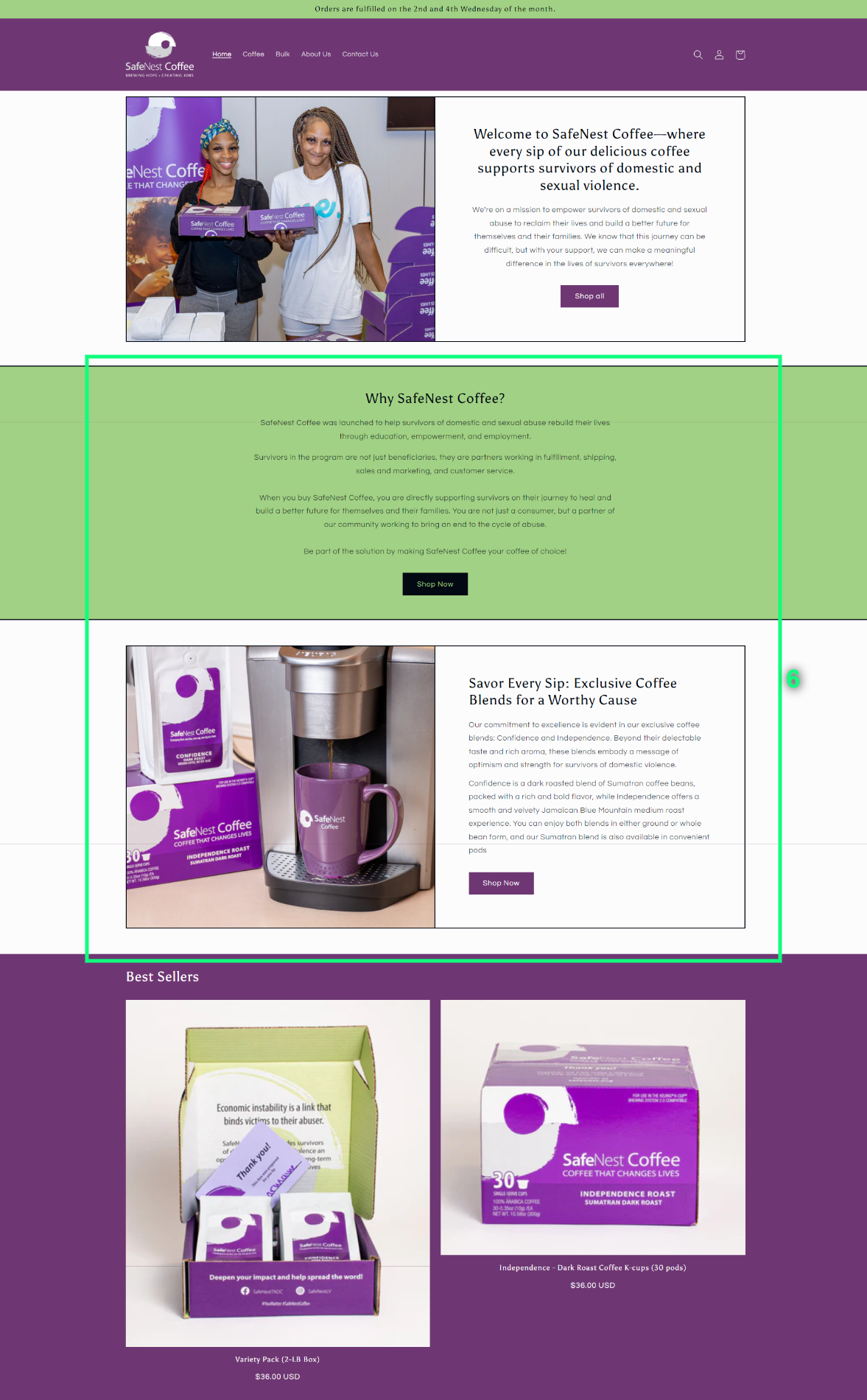
- Wasted use of space. The image could be larger (for emotional impact) and the text should be minimal. Could use an image slider, too, to show additional content.
- TL, DR; A user’s attention on the top of the 1st page is more significant to:
- the image,
- the call-to-action button,
- and bigger texts.
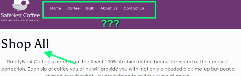
- The Shop All button goes to the Product page, but the menu item highlight doesn’t show which part of the navigation you’re in.

- Accessibility Issue: Icon-only buttons must have an accessibility tooltip when someone hovers their mouse button over it (on mobile devices, hold-tap).
- (Below) The Shop Now Call-to-Actions are too redundant on a single page. This can be consolidated.
- (Right) the front page product images are changing on hover. Aesthetically, this is “funky” /” kooky” to experience.

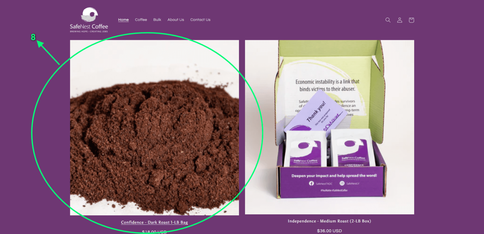
- Coffee Ground on a white surface is an undramatic and boring image. Consider changing the creative direction of the photography. For example, the photo below is rather appealing to compare:

- (Below) The content strategy is absent on the front page. The information is scattered and redundant. Based on the messaging for each section, there are at least two main goals: (1) to educate the consumer that buying the coffee products will help survivors make a living, and (2) to convey that it’s not just selling run-of-the-mill coffee, it’s rather great coffee. This must be communicated in two easy-to-read sections only on the front page. How do you say, “Buy our coffee, help the victims”, and “We offer great, quality coffee” in under 10 seconds each?
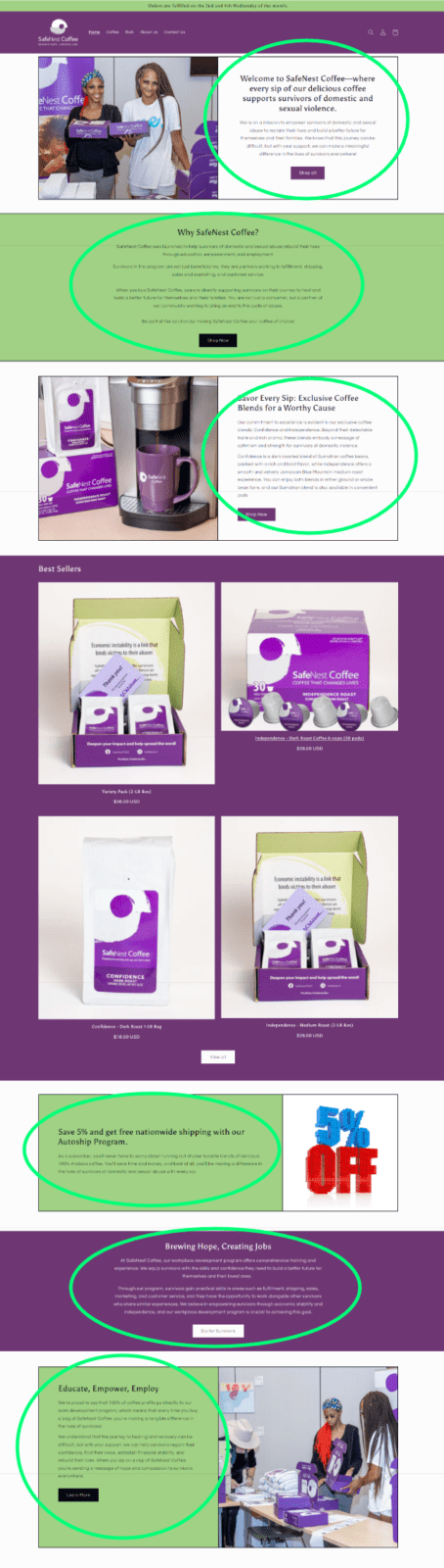
- The Top Navigation: (Below) When scrolling down, the user loses the navigation, only to see it again when slightly scrolling up. A minor inconvenience, but aesthetically non-standard for top-navigation behaviour.
- Lack of Privacy Policy: (Below) While there is uncertainty about mandatory privacy policy statements in Nevada, it’s standard practice nationally and internationally.
Minimise the Jump to the Products page
When you don’t have more than 20 products to sell, it’s best to keep everything on a single page. Categorization is important, but not per page.
Instead of going through this:
…consider shortening your visitor’s trip by at least one step:

As a single page, the new “Coffee” page might look like this:

Standardize the contact page
There were several issues in regard to web standards that the Contact page committed:
- Make the Name and the message required. Allowing the page to send a message with just an email is inappropriate. It makes an unnecessary nuisance for the site manager.
- Provide Proper information on phone number formats.
- Make sure the phone number field does not accept 2-digit entries (right now, it does). Globally phone numbers have to be 5-12 digits maximum. For the U.S., it’s 7-10 digits.
- Consider adding a character/word limit to the message. A test was able to send a 10,000-word message.
Internal Only Products
Internal-only products are appearing on the site (undisclosed). Consider removing them on production sites, and only making them available on “Staging” sites.